


Very good like always 😉
Create a dynamic category list
-
Ps - if anyone likes the theme in the screenshot, it’s called “Blackout” and will be featured in V3 of sudonix when released.
-
@DownPW has just pointed out a valid issue here. If you have lots of categories, then the list can easily extend the browser window, and if you resize the browser, you won’t be able to access it properly. For this to work, you’d need to apply custom CSS to that - for example, the below, but it should only be applied at a minimum of
1200pxso will need to use a media class.li#thecategories { min-width: 250px; font-size: 90%; overflow: auto; height: calc(100vh - 110px); }This specific CSS calculates the height of the browser window, then removes some of it to allow for the bottom bar in desktop view (note that you might not be using this, so you’ll need to adjust the
calcvalue as you see fit). -
I’ll revise the original post to reflect this
-
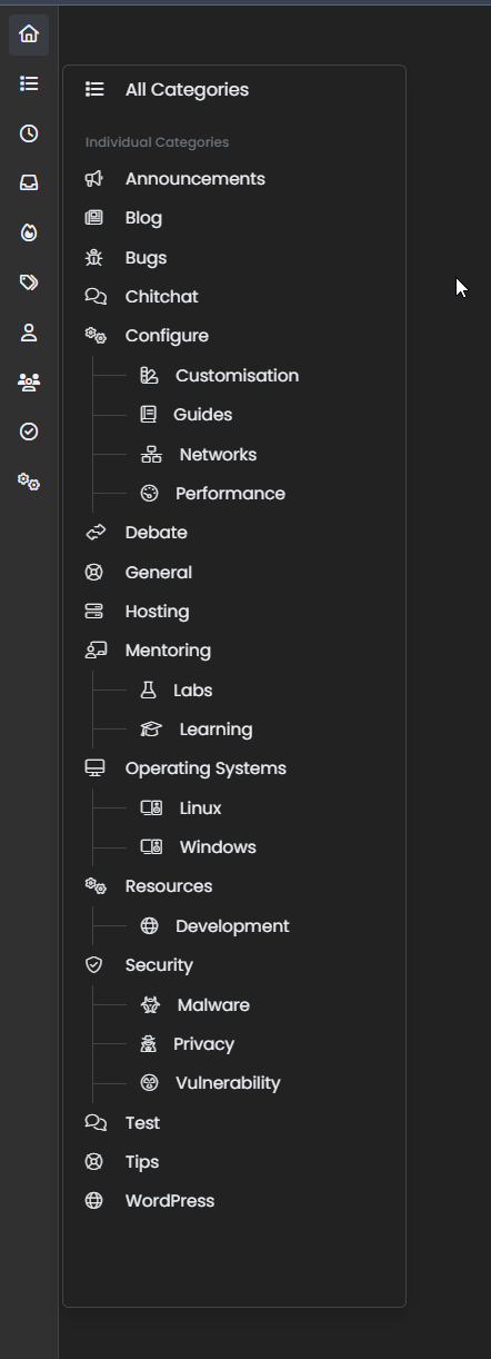
I’ve been playing around with this today, and created a “tree” view
-
If you’d like the code for this, then it’s below (it’s essentially a “fork” of the original to allow for extra classes)
JS
$(document).ready(function() {
    $.getJSON('/api/categories', function(data, status) {
        $.each(data.categories, function(key, value) {
            var categorylist = $(" \
	<li class='dropdown-item tree-root'><span class='category-menu'><i class='fal " + this.icon + "'></i><a style='display: inherit;' class='dropdown-item rounded-1' href='/category/" + this.slug + "'>" + this.name + "</a></span></li> \
		<ul class='tree-branch' style='list-style: none;'>" +
                this.children.map(c => `<li class='dropdown-item tree-node'><span class='category-menu-tree-node'><i class='fal ${c.icon}'></i><a class='dropdown-item rounded-1' style='display: inherit;' href='/category/${c.slug}'>${c.name}</a></span></li>`).join(" ") +
                "</ul>"
            );
            if ($(window).width() < 767) {
                $(".bottombar #thecategories").append(categorylist);
            } else {
                $(".sidebar-left #thecategories").append(categorylist);
            }
        });
    });
});
CSS
ul.tree-branch {
    border-left: 1px solid var(--bs-border-color);
    margin-left: 22px;
}
li.tree-node:before {
    border-bottom: 1px solid var(--bs-border-color);
    position: relative;
    top: -0.3em;
    height: 1em;
    width: 30px;
    content: "";
    display: inline-block;
    left: -48px;
}
span.category-menu-tree-node {
    margin-left: -35px;
}
NOTE: I use variables for all of my CSS, so you’ll need to substitute
varwith your ownHEXvalues. Also note, that you still need the original CSS from the first post for this to work - what is listed above only provides you with the tree, branches, and nodes effect. -
This looks so cool, thanks @phenomlab @DownPW
-
@phenomlab is there something wrong with the category list panel?
edit: it is fixed now. When I minimize the screen size on my computer and then expand it again, the panel goes blank. But it is fixed when I refresh the page, I guess this is something expected.
-
@crazycells No, not at all. I can’t reproduce this, but that does sound like a hardware acceleration issue. What happens if you disable that (I’m assuming Chrome here if of course, but the same applies for other browsers)
https://pureinfotech.com/disable-hardware-acceleration-chrome/
-
@phenomlab sorry, my mistake, it is fixed now.
I am using Firefox, but this morning I needed to restart to update Firefox, so I believe I was having the problem yesterday night because of the outdated browser. -
@crazycells Good. Glad to hear it’s an even simpler fix
")
-
 undefined phenomlab moved this topic from Customisation on
-
Just circling back here as I’ve been helping @cagatay this morning on his site, and noticed that if you use a mixture of
fa-brandsandfa-solidthen the code supplied above may produce some odd looking results.If this is the case, replace the function with this
$(document).ready(function() { $.getJSON('/api/categories', function(data, status) { $.each(data.categories, function(key, value) { var iconClass = 'fa'; // Default to 'fa' if the icon type is not recognized // Check if the icon is FontAwesome Unicode if (this.icon.startsWith('&#x') || this.icon.startsWith('')) { iconClass = 'fa'; } else if (this.icon.startsWith('fab')) { iconClass = 'fab'; } var categorylist = $(" \ <li class='dropdown-item tree-root'><span class='category-menu'><i class='" + iconClass + " " + this.icon + "'></i><a style='display: inherit;' class='dropdown-item rounded-1' href='/category/" + this.slug + "'>" + this.name + "</a></span></li> \ <ul class='tree-branch' style='list-style: none;'>" + this.children.map(c => { var childIconClass = 'fa'; // Default to 'fa' for child icons // Check if the child icon is FontAwesome Unicode if (c.icon.startsWith('&#x') || c.icon.startsWith('')) { childIconClass = 'fas'; } else if (c.icon.startsWith('fab')) { childIconClass = 'fab'; } return `<li class='dropdown-item tree-node'><span class='category-menu-tree-node'><i class='${childIconClass} ${c.icon}'></i><a class='dropdown-item rounded-1' style='display: inherit;' href='/category/${c.slug}'>${c.name}</a></span></li>`; }).join(" ") + "</ul>" ); if ($(window).width() < 767) { $(".bottombar #thecategories").append(categorylist); } else { $(".sidebar-left #thecategories").append(categorylist); } }); }); });In fact, if you want to replace it anyway to make your experience “future proof”, you can use this code now
-
-
-
Block Domain
Solved Let's Build It -
-
-
-
-