Very good like always 😉
Switch between list and card view function
-
I decided that Hostrisk, my infosec news site needed a facelift, and given the nature of the information being presented, it didn’t lean itself very well to a forum in my view… So, I changed it
")
Because of the CSS changes, the layout only changes at
1200pxso if you’re viewing the site itself on a mobile, you won’t notice any difference. However, the desktop view now looks like this
This is all CSS with no
jswhatsoever.NOTE: For the latest stable release, see https://sudonix.org/post/8433
Enjoy
-
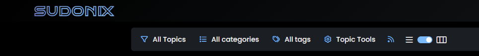
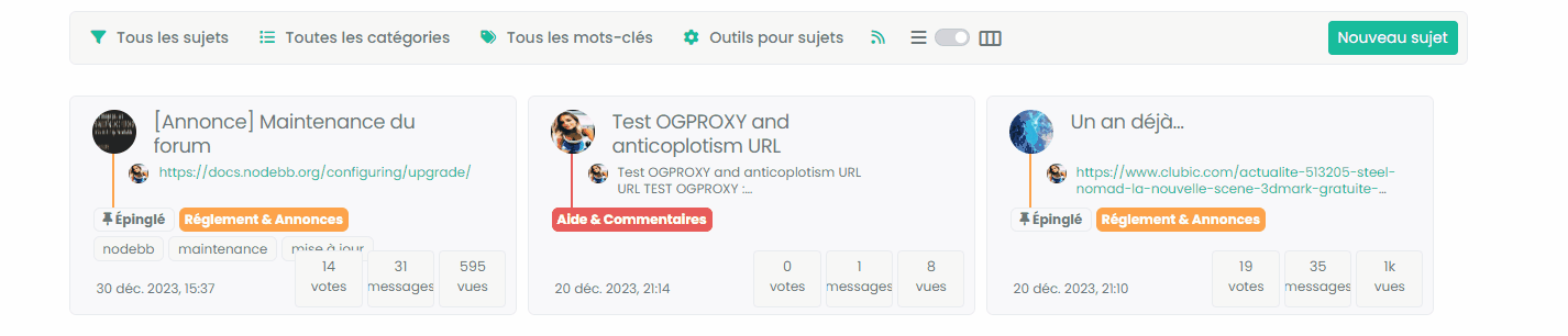
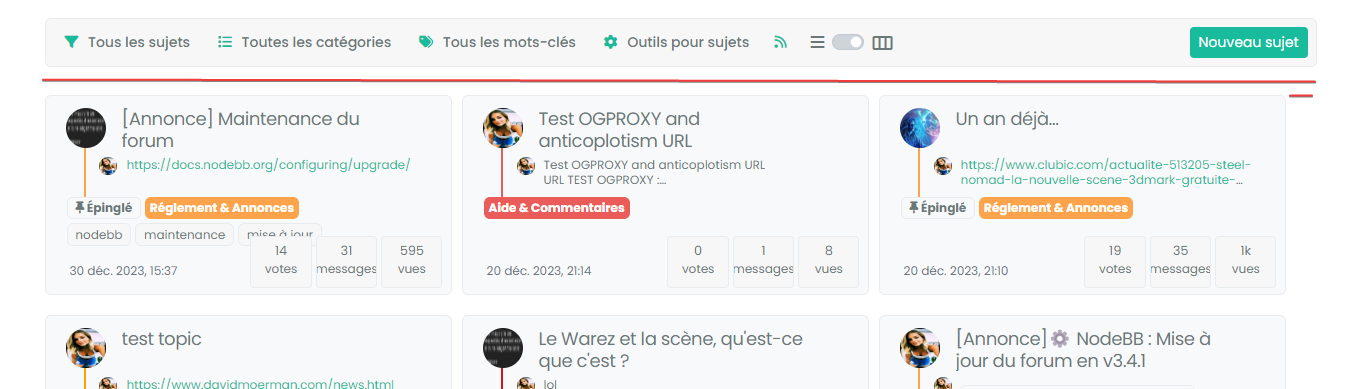
This new type of layout had me curious, so I’ve enabled it here (very very beta - there are bugs). On the topic list header, you’ll see a toggle switch that flips between list and card view

Note that the session state is not saved, and there are some formatting issues, but it’s here for you to try.
EDIT: Toggle switch is shown below

EDIT2: The toggle issue is resolved, as is the session state.

-
A picture says a thousand words, so here’s a short video so you can see how it works.
-
I love this @phenomlab
Very very good job
will you share the code when it is mature?
-
@DownPW of course. The real issue here is that it’ll need some customising because it fits with the css I’m using here.
I’ll explain more once I have it stable and ready for release.
-
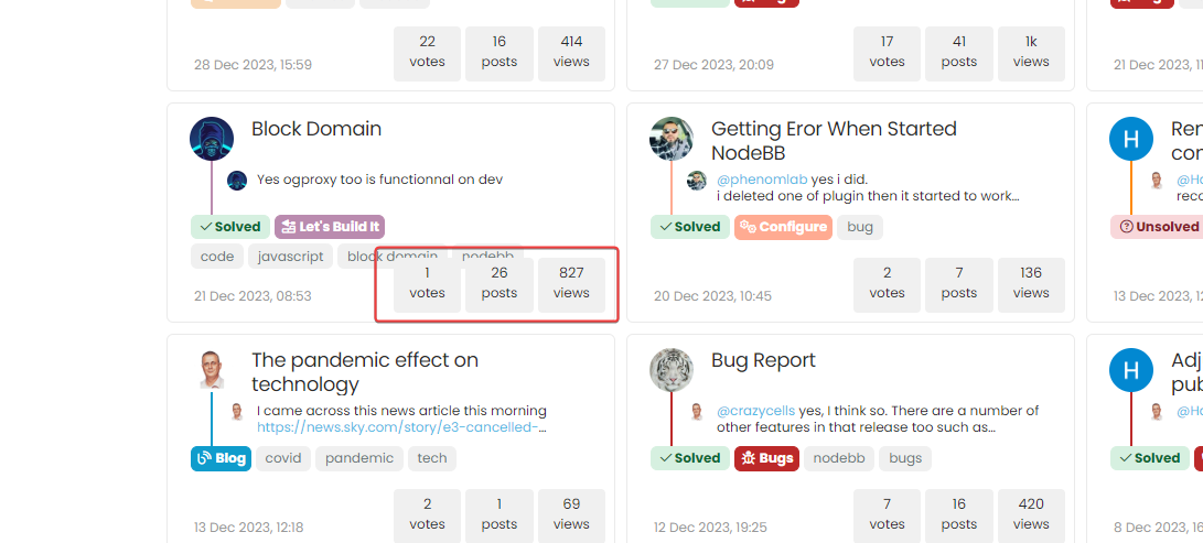
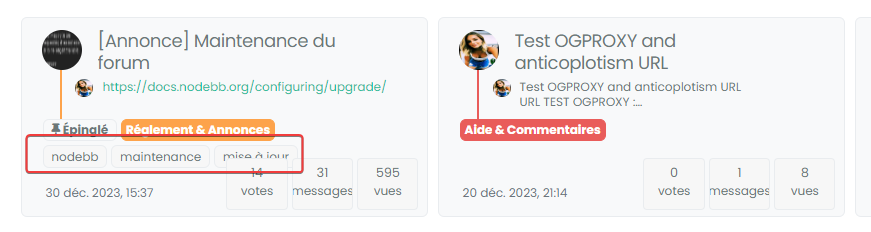
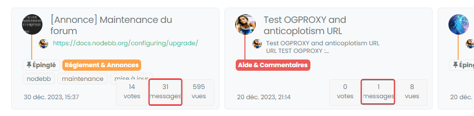
Just see this little bug here with tags/stats posts :
-
@DownPW yes, I’m aware of this. It’s not a bug as such, but due to screen estate. Because the original css uses 100% width and the new layout uses 32%, it severely restricts the available space.
One way of alleviating this, which I am in the process of reviewing is to limit the number of tags shown. I considered using either
nth-childortype-of-childin css to do this, although this doesn’t appear to work as intended so the only other route isjs.Still undecided currently, but another option is to hide the tags altogether. However, this is counter productive in my view as filtering based on tags might look odd if the specific tag you’ve searched for doesn’t display, but instead, you see another one and think the search isn’t working properly - obviously, it is, but if that specific tag is hidden, it’s easy to understand the confusion.
-
The only feasible way to do this is to increase the
heightandmax-heightof the card itself by20px. This has been applied to the view, and effective now. -
@phenomlab said in Switch between list and card view function:
The only feasible way to do this is to increase the
heightandmax-heightof the card itself by20px. This has been applied to the view, and effective now.great
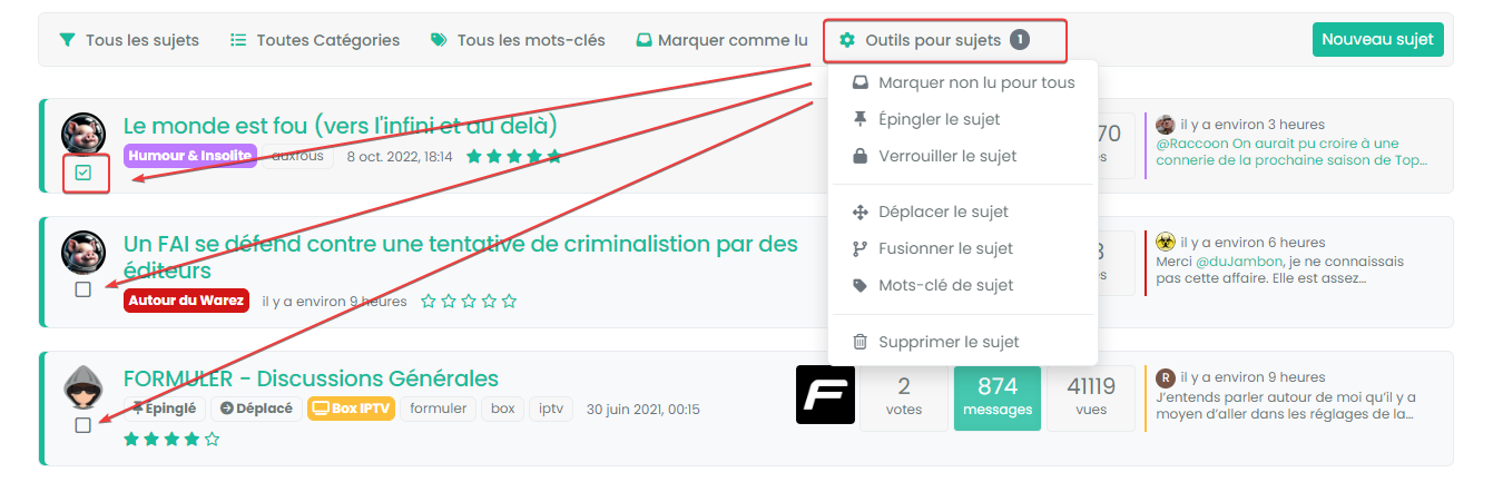
I also wonder about the selection of topics if we use the subject tools on the administrator side, does it work? (You know, the little selection check mark)
-
@DownPW Yes, that still works. A small cosmetic issue with the selection box placement which I need to fix, but…
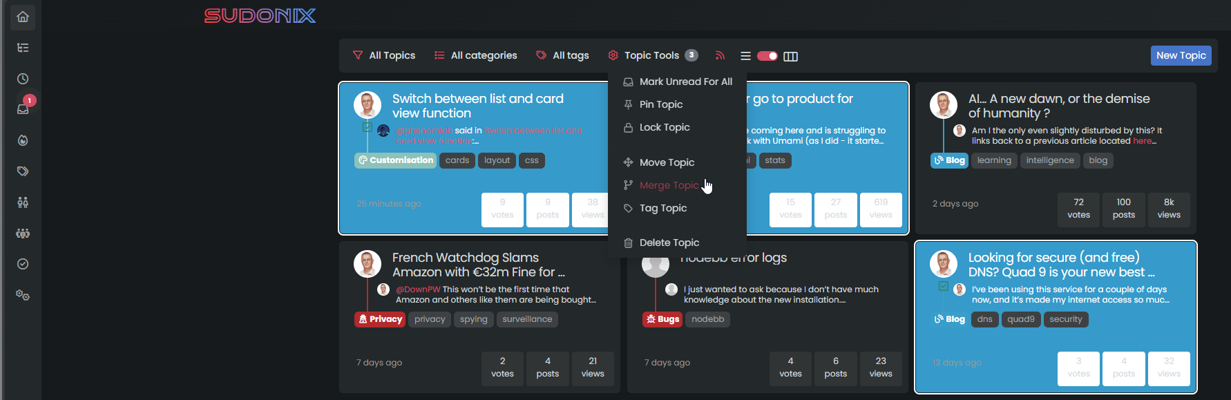
Moved the positioning of the checkbox to the bottom left. Why not the top right? Because that means we have to truncate the
headerwhich makes it look odd - it’s width overlaps the checkbox, and evenz-indexhas no marked effect withposition.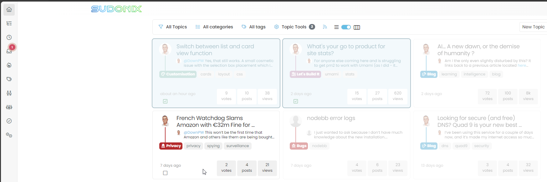
-
Base code release below. WARNING - this code is stable, but still in beta meaning that there may be bugs. I think I’ve resolved most of them, so report any you find in this thread please.
https://github.com/phenomlab/harmony-card-view
Instructions
- Copy all of the code in
functions.jsand append this toAdmin->Appearance->Custom Content->Custom Javascriptand ensure you change thevar href = "/path/to/card.css";variable located within thefunctions.jsfile so that it points to the actual location where you stored the file - for example:var href = "/assets/card.css"; - Ensure Custom JS is enabled, and save
- Copy the
card.cssfile to your hosting ideally in thepublicpath inside yourNodeBBfile structure. - Reload the site and test
You should see the toggle button appear in the card list view
IMPORTANT: Your CSS layout is likely to be vastly different to that of Sudonix (there are some exceptions where sites that I have prior approved have the same layout - you know who you are), and this means you should first deploy this into a test environment and modify the layout so that it fits your site.
I will probably provide a “raw” version of the
cssthat is based on stock Harmony with no mods in due course depending on the popularity of this new function. - Copy all of the code in
-
I will probably have small modifications to make to adapt to my CSS and my Material View function but I will test this on my test environment very very quickly.
Thanks Mark. In any case, I think this idea is great.
-
@DownPW said in Switch between list and card view function:
test this on my test environment very very quickly
Let me know how you get on
-
Found a small bug already which is CSS related
I’ll fix this tomorrow and provide an update
-
So I tested and here are my remarks:
-
Pay attention to the name of the JSS file in the Javascript code. I put underscores and the CSS was not taken into account.
-
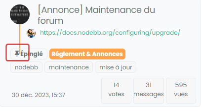
The topic selection check box is difficult to check: most of the time I enter the topic rather than checking the box :
- I still have the problem displaying tags :
- For my part, in French, the boxes are a little tight here, I’ll see what I can do :
- If you have a pinned topic with the pinned label, the line is visible behind the label
–> For this, maybe add a background color to this loke this ? :
[component="topic/pinned"].border-gray-300 { background: var(--bs-body-navbar) !important; }- Why not take the same width as the toolbar here ? :
Many thanks again Mark
-
-
@DownPW All good comments, thanks. Don’t forget that your CSS is also very customized over the stock that comes with NodeBB, but I’m quite surprised by this
@DownPW said in Switch between list and card view function:
The topic selection check box is difficult to check: most of the time I enter the topic rather than checking the box
Perhaps I missed some final modifications here, but I cannot reproduce that - will need to check
@DownPW said in Switch between list and card view function:
I still have the problem displaying tags :
Again, surprised by that as it was addressed in the final code. Will need to check
@DownPW said in Switch between list and card view function:
If you have a pinned topic with the pinned label, the line is visible behind the label
Yes, I’m aware of that one - the CSS you propose would work, but not for those without custom CSS
@DownPW said in Switch between list and card view function:
Why not take the same width as the toolbar here ?
Because you cannot fit 32% into 100% even with simple math
It needs either paddingormargin- both of which will be negative, but I’ve done it here
I’m going to release a vanilla harmony CSS file (working on it now) shortly. This will be the starting point that will fit most users, but obvously, the more customized CSS you have, the more work it needs.
-
no problem,
I noticed that as soon as I make changes to the CSS file, I have to empty the cache and close the browser so that the changes are taken into account even in incognito mode.
-
@DownPW Yes, I have a fix for that also going forward. Will supply that once I’m done with testing.
-
@phenomlab said in Switch between list and card view function:
@DownPW Yes, I have a fix for that also going forward. Will supply that once I’m done with testing.
No worries my friend :), I’m just making the comments to make this code concrete because I find it excellent.
Now that I have seen that I have to close the browser each time I make a change, this seems OK to me except for the last 2 points mentioned which you are currently working on.
@phenomlab said in Switch between list and card view function:
Because you cannot fit 32% into 100% even with simple math It needs either padding or margin - both of which will be negative, but I’ve done it here
-
@DownPW thanks. I have an almost stable vanilla harmony version I’ll be posting this weekend.
-
-
-
-
-
-
-
Bug Navbar CSS
Solved Customisation -
NodeBB Design help
Solved Customisation