@Panda if you used the Ubuntu PPA, I think this only goes as far as 6.x if I recall correctly.
[NODEBB] Help for my custom CSS
Solved
Customisation
-
Seems to be definitevely better. Hope have no other effect
")
Thank you Mark ! -
@DownPW there shouldn’t be - it’s a fairly specific target, but if you do experience odd behaviour, let me know.
-
Hello mark,
I would like to change the appearance of deleted messages in topics but I can’t find the target or the component.
For example, opacity or left timeline color of the deleted post
And I would like the same things for deleted topics
Hard to find these component or class !
Thanks
-
@DownPW The topic CSS for this should be as below (note, I added the background and color)
ul.categories-list li.deleted, ul.topics-list li.deleted {
    opacity: .6;
    background: red;
    color: yellow;
}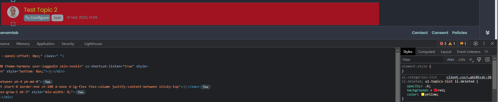
Threads for deleted posts in topics are covered by the
.deletedclass (note, I added the background and color).deleted { background: black; color: orange; }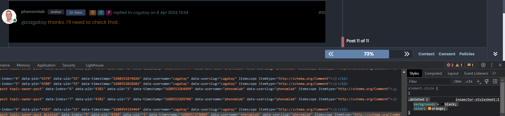
-
Thanks you Mark !
I know why I have don’t find this directive lol : I got my brushes tangled up in the dev console
So for deleted post , I prefer use
li.pt-4.deletedinstead of.deletedbecause.deletedis in conflict withul.categories-list li.deleted, ul.topics-list li.deleted -
@DownPW yes, fair point. The
.deletedclass is implicit so you need to make it unique using other classes before it to create a chain which you’ve done. -
Hello,
because I use nsembed plugin now, I see the frame are a bit little compared to this forum which uses the same plugin.
How did you handle that Mark?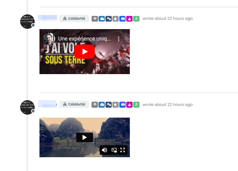
-
@DownPW sorry, I’m not entirely sure what you mean?
-
Sorry the player is small compared to here. I would like to enlarge them ^^
")
– Mine :
– Here on sudonix :
-
@DownPW Try this
.embed-container iframe {
    width: 600px;
    height: 300px;
}
Obviously, adjust
widthandheightas required -
Hmm I have this problem with hover background color on close button on modal chat on my dev instance.
The background color is black :
And it seems my code doesn’t work :
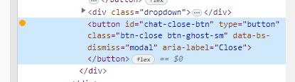
I confess that I do not fully understand why I have black and that my code is not interpreted correctly.
Thanks in advance for your help my friends
-
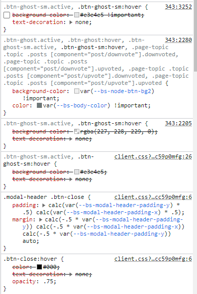
@DownPW It’s caused by this css
.btn-close {
    filter: var(--bs-node-btn-close-color) !important;
}
If you remove that filter, the issue will be resolved.
-
Thanks. It’s an error.
Why I have used filter lol -
@DownPW I figured

-
So actually after research I was using as this was used in old core code.
By removing the “Filter” directive it works for the black background on the hover of the close button: cool !!
But for the color of the cross icon itself (In fact it is not an icon but an image) it is black for light themes, no problem but it remains black for dark themes so it becomes invisible !!!
So here is my solution :
.btn-close { background: var(--bs-node-btn-close-bg) !important; }- for light theme:
--bs-node-btn-close-bg: transparent url("data:image/svg+xml,%3csvg xmlns='http://www.w3.org/2000/svg' viewBox='0 0 16 16' fill='%23000'%3e%3cpath d='M.293.293a1 1 0 0 1 1.414 0L8 6.586 14.293.293a1 1 0 1 1 1.414 1.414L9.414 8l6.293 6.293a1 1 0 0 1-1.414 1.414L8 9.414l-6.293 6.293a1 1 0 0 1-1.414-1.414L6.586 8 .293 1.707a1 1 0 0 1 0-1.414z'/%3e%3c/svg%3e") center/1em auto no-repeat;- for dark themes :
--bs-node-btn-close-bg: transparent url("data:image/svg+xml,%3csvg xmlns='http://www.w3.org/2000/svg' viewBox='0 0 16 16' fill='%23fff'%3e%3cpath d='M.293.293a1 1 0 0 1 1.414 0L8 6.586 14.293.293a1 1 0 1 1 1.414 1.414L9.414 8l6.293 6.293a1 1 0 0 1-1.414 1.414L8 9.414l-6.293 6.293a1 1 0 0 1-1.414-1.414L6.586 8 .293 1.707a1 1 0 0 1 0-1.414z'/%3e%3c/svg%3e") center/1em auto no-repeat;I see you have the same problem here on sudonix, test that
-
@DownPW thanks. I’ll check this.
-
no problem. Always @phenomlab
I want to test your author badge (fa) :
Can you provide CSS for this please ?
Thank you
edit:
tetsing this but i don’t think i’m on the good road
.topic-owner-post [itemprop=author]:before{ font-family: "Font Awesome 6 pro"; font-style: normal; content: "\e1e4"; left: 100px !important; text-align: left !important; position: absolute; } -
@DownPW heh, that also needs some
jsto make that work.Edit - add this
jsblockfunction addAuthorBadge() { $(".topic-owner-post").each(function() { var $authorElement = $(this).find(".text-nowrap:first"); // Check if the author badge already exists if (!$authorElement.find(".author").length) { // Prepend the author element $authorElement.append("<span class='author' data-toggle='tooltip' data-placement='left' title='Topic Author'><span class='author-icon'><i class='fa-regular fa-message-quote'></i></span>"); // Add tooltip on hover $authorElement.find(".author").tooltip({ content: "Topic Author", track: true // This enables the tooltip to track the mouse movement }); } }); } $(document).ready(function() { $(window).on('action:posts.loaded', function(data) { addAuthorBadge(); }); }); $(document).ready(function() { $(window).on('action:ajaxify.end', function(data) { addAuthorBadge(); }); }); -
OMG make sense
Thanks dude
Did this solution help you?
-
MogoDB v6 to v7 upgrade
Solved Configure -
-
-
-
-
-
NodeBB Discord Plugins
Unsolved Customisation -