Skip to content

[NODEBB] Help for my custom CSS

Solved Customisation
  • Yes thnaks it’s a solution but is there another way? Like targeting icons when the dropdown is active rather than changing the background because I already use --bs-dropdown-link-active-bg elsewhere

    Otherwise we can cheat by changing the color of the icons at any time but I find it less good.

    maybe change html for add specific class

    It’s just a question, I can eventually satisfy myself with this solution

  • @DownPW Try this

    a.active i {
        color: #ffffff!important;
    }
    
  • Seems to be definitevely better. Hope have no other effect 🙂
    Thank you Mark !

  • @DownPW there shouldn’t be - it’s a fairly specific target, but if you do experience odd behaviour, let me know.

  • Hello mark,

    I would like to change the appearance of deleted messages in topics but I can’t find the target or the component.

    image.png

    For example, opacity or left timeline color of the deleted post

    And I would like the same things for deleted topics

    Hard to find these component or class !

    Thanks 🙂

  • @DownPW The topic CSS for this should be as below (note, I added the background and color)

    ul.categories-list li.deleted, ul.topics-list li.deleted {
        opacity: .6;
        background: red;
        color: yellow;
    }
    

    aba26d71-17be-41bf-88ab-e5bd7b63071d-image.png

    Threads for deleted posts in topics are covered by the .deleted class (note, I added the background and color)

    .deleted {
        background: black;
        color: orange;
    }
    

    914852d6-1a94-4e63-8bc2-f86e3e5a6ee4-image.png

  • Thanks you Mark !

    I know why I have don’t find this directive lol : I got my brushes tangled up in the dev console 🙂

    So for deleted post , I prefer use li.pt-4.deleted instead of .deleted because .deleted is in conflict with ul.categories-list li.deleted, ul.topics-list li.deleted 🙂

  • @DownPW yes, fair point. The .deleted class is implicit so you need to make it unique using other classes before it to create a chain which you’ve done.

  • Hello,

    because I use nsembed plugin now, I see the frame are a bit little compared to this forum which uses the same plugin.
    How did you handle that Mark?

    image.png

  • @DownPW sorry, I’m not entirely sure what you mean?

  • Sorry the player is small compared to here. I would like to enlarge them ^^ 😉

    – Mine :

    image.png

    – Here on sudonix :

    72b1af86-cb23-4bb3-8d08-0ceb4bb27435-image.png

  • @DownPW Try this

    .embed-container iframe {
        width: 600px;
        height: 300px;
    }
    

    Obviously, adjust width and height as required

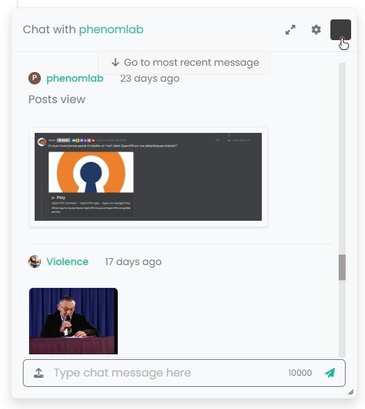
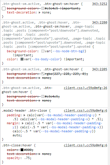
  • Hmm I have this problem with hover background color on close button on modal chat on my dev instance.
    The background color is black :

    f1c61a50-3b64-4470-89fc-182c8027a530-image.png

    And it seems my code doesn’t work :

    7cff1a19-8d5b-4889-a798-1e13898f1963-image.png

    8d427049-7987-4a2c-a0d9-4c26b475cafb-image.png

    I confess that I do not fully understand why I have black and that my code is not interpreted correctly.

    Thanks in advance for your help my friends 😉

  • @DownPW It’s caused by this css

    .btn-close {
        filter: var(--bs-node-btn-close-color) !important;
    }
    

    If you remove that filter, the issue will be resolved.

  • Thanks. It’s an error.
    Why I have used filter lol

  • @phenomlab

    So actually after research I was using as this was used in old core code.

    By removing the “Filter” directive it works for the black background on the hover of the close button: cool !!

    But for the color of the cross icon itself (In fact it is not an icon but an image) it is black for light themes, no problem but it remains black for dark themes so it becomes invisible !!!

    So here is my solution :

    .btn-close {
      background: var(--bs-node-btn-close-bg) !important;
    }
    
    • for light theme:
    --bs-node-btn-close-bg: transparent url("data:image/svg+xml,%3csvg xmlns='http://www.w3.org/2000/svg' viewBox='0 0 16 16' fill='%23000'%3e%3cpath d='M.293.293a1 1 0 0 1 1.414 0L8 6.586 14.293.293a1 1 0 1 1 1.414 1.414L9.414 8l6.293 6.293a1 1 0 0 1-1.414 1.414L8 9.414l-6.293 6.293a1 1 0 0 1-1.414-1.414L6.586 8 .293 1.707a1 1 0 0 1 0-1.414z'/%3e%3c/svg%3e") center/1em auto no-repeat;
    
    • for dark themes :
    --bs-node-btn-close-bg: transparent url("data:image/svg+xml,%3csvg xmlns='http://www.w3.org/2000/svg' viewBox='0 0 16 16' fill='%23fff'%3e%3cpath d='M.293.293a1 1 0 0 1 1.414 0L8 6.586 14.293.293a1 1 0 1 1 1.414 1.414L9.414 8l6.293 6.293a1 1 0 0 1-1.414 1.414L8 9.414l-6.293 6.293a1 1 0 0 1-1.414-1.414L6.586 8 .293 1.707a1 1 0 0 1 0-1.414z'/%3e%3c/svg%3e") center/1em auto no-repeat;
    

    I see you have the same problem here on sudonix, test that 😉

  • @DownPW thanks. I’ll check this.

  • no problem. Always @phenomlab

    I want to test your author badge (fa) :

    image.png

    Can you provide CSS for this please ?

    Thank you

    edit:

    tetsing this but i don’t think i’m on the good road

    .topic-owner-post [itemprop=author]:before{
        font-family: "Font Awesome 6 pro";
        font-style: normal;
        content: "\e1e4";
        left: 100px !important;
        text-align: left !important;
        position: absolute;
    }
    
  • @DownPW heh, that also needs some js to make that work.

    Edit - add this js block

    function addAuthorBadge() {
      $(".topic-owner-post").each(function() {
        var $authorElement = $(this).find(".text-nowrap:first");
        
        // Check if the author badge already exists
        if (!$authorElement.find(".author").length) {
          // Prepend the author element
          $authorElement.append("<span class='author' data-toggle='tooltip' data-placement='left' title='Topic Author'><span class='author-icon'><i class='fa-regular fa-message-quote'></i></span>");
          // Add tooltip on hover
          $authorElement.find(".author").tooltip({
            content: "Topic Author",
            track: true // This enables the tooltip to track the mouse movement
          });
        }
      });
    }
    
    
    $(document).ready(function() {
      $(window).on('action:posts.loaded', function(data) {
          addAuthorBadge();
        });
    });
    
    
    $(document).ready(function() {
      $(window).on('action:ajaxify.end', function(data) {
          addAuthorBadge();
        });
    });
    

Did this solution help you?
Did you find the suggested solution useful? Why not buy me a coffee? It's a nice gesture, and a great way to show your appreciation 💗

  • Page control arrows for PWA

    Solved Customisation
    27
    25 Votes
    27 Posts
    404 Views

    @crazycells it is, yes - I think I’ll leave it as there is no specific PWA CSS classes I know of. Well, you could use something like the below, but this means multiple CSS files for different operating systems.

    /** * Determine the mobile operating system. * This function returns one of 'iOS', 'Android', 'Windows Phone', or 'unknown'. * * @returns {String} */ function getMobileOperatingSystem() { var userAgent = navigator.userAgent || navigator.vendor || window.opera; // Windows Phone must come first because its UA also contains "Android" if (/windows phone/i.test(userAgent)) { return "Windows Phone"; } if (/android/i.test(userAgent)) { return "Android"; } if (/iPad|iPhone|iPod/.test(userAgent) && !window.MSStream) { return "iOS"; } return "unknown"; // return “Android” - one should either handle the unknown or fallback to a specific platform, let’s say Android }

    Once you’re in that rabbit hole, it’s impossible to get out of it.

  • 1 Votes
    3 Posts
    148 Views

    @phenomlab yes, it is 🙂 thanks a lot…

  • Rotating Star Effect

    Solved Let's Build It
    17
    12 Votes
    17 Posts
    466 Views

    @phenomlab thanks a lot for these, both of the below are awesome! ♥

    https://codepen.io/bennettfeely/pen/vYLmYJz

    https://codepen.io/C-L-the-selector/pen/MWZbWBo

  • 0 Votes
    5 Posts
    194 Views

    @Panda as, yes, now I understand and that makes 100% sense. It means those who get down voted can still have an opinion and use common services.

    And yes, you’re right. Rather than down vote, just ignore if you don’t agree.

  • 1 Votes
    4 Posts
    476 Views

    @eeeee if you’re using the console, you could try

    node app.js > app.log 2>&1

    This would redirect stdout to a file named app.log and redirect stderr to stdout.

    I’m not sure about standard logging under NodeBB, but there is an error log located at logs/error.log.

    Failing that, you could always stop the NodeBB service then use ./nodebb dev from the console which would then provide debug output.

  • [NODEBB] Welcome Message

    Solved Customisation
    18
    13 Votes
    18 Posts
    2k Views

    For anyone reviewing this post, there’s an updated version here that also includes an sunrise / sun / moon icon depending on the time of day

    https://sudonix.com/topic/233/nodebb-welcome-message-with-logo-footer-change/3?_=1645445273209

  • nodebb dropdown menu

    Solved Configure
    5
    0 Votes
    5 Posts
    428 Views

    @phenomlab said in nodebb dropdown menu:

    @kurulumu-net You set it like the below example taken from this site

    aae36790-3257-4bb2-ad5a-0d744309876a-image.png

    Which presents this

    77f47260-2941-4afe-9614-8e17dcfc8c19-image.png

    Very interesting…

    I actually thought this wasn’t possible, as I remember it being asked in the NodeBB forum.

    Is this something new that’s been implemented? I’ll 100% be doing that when I’m on the laptop over the weekend.

  • NodeBB Design help

    Solved Customisation
    8
    2 Votes
    8 Posts
    829 Views

    @riekmedia I’ve applied some new CSS to your site. Can you reload the page and try again ?

    For the record, this is what I added

    #footer { background: #2d343e; border-top: 4px solid #2d343e; font-size: 0.9em; margin-top: 70px; padding: 80px 0 0; position: relative; clear: both; bottom: 0; left: 0; right: 0; z-index: 1000; margin-left: -15px; margin-right: -338px; }

    The /categories page seems a bit messed up, so looking at that currently

    EDIT - issued some override CSS in the CATEGORIES widget

    <!--- CSS fix for overspill on /categories page - DO NOT DELETE --> <style> #footer { margin-right: -45px; } </style>

    That should resolve the /categories issue.