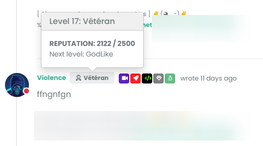
Skip to content

nodebb-user-level customisation : popover element

Solved Customisation
  • hello
    How can I target the following CSS elements ?
    I have custom themes and I need to modify these elements because on dark theme, we have bug like here on Sudonix.

    image.png

    image.png

    @barisusakli said It’s a standard bootstrap popover so you can use the .popover class to target it.
    It has .popoover, .popover-header, .popover-body, popover-arrow classes but when I target these, I loose border and border-radius and arrow target seems to doesn’t work

    I need background boy, background title, border color, border-radius, arrow color, etc…

    Thanks in advance

  • @DownPW This isn’t as simple as it looks, because bootstrap is using inset border radius

    Here’s a workaround

    .popover-body {
        background: var(--bs-body-bg) !important;
        color: var(--bs-body-color) !important;
        border: 1px solid var(--bs-border-color);
        border-radius: 0 0 0.375rem 0.375rem;
        margin: 0px;
    }
    .popover-header {
        background-color: var(--bs-alert-info-bg);
        color: var(--bs-alert-info-color);
        border-top-left-radius: 0.375rem;
        border-top-right-radius: 0.375rem;
        margin: 0px;
    }
    .bs-popover-auto[data-popper-placement^=top]>.popover-arrow::after, .bs-popover-top>.popover-arrow::after,{
        border-top-color: var(--bs-border-color);
    }
    .bs-popover-auto[data-popper-placement^=top]>.popover-arrow::after, .bs-popover-bottom>.popover-arrow::after,{
        border-bottom-color: var(--bs-border-color);
    }
    .bs-popover-auto[data-popper-placement^=left]>.popover-arrow::after, .bs-popover-end>.popover-arrow::after {
        border-left-color: var(--bs-border-color);
    }
    .bs-popover-auto[data-popper-placement^=right]>.popover-arrow::after, .bs-popover-end>.popover-arrow::after {
        border-right-color: var(--bs-border-color);
    }
    

    Then, in the widgets section - /admin/extend/widgets select the account/profile.tpl widget, and add the below HTML

    <style>
    .popover-body {
        border-radius: 0.375rem;
    }
    </style>
    

    32d9fac7-67b1-4ea2-9aa5-37eba0ab776e-image.png

    Save the widget.

    This is the closest you can get unfortunately. It’s something of a hack, but a necessary evil.

  • Images are not seen

  • arf I can’t edit first post

    image.png

    image.png

  • @cagatay Initial post edited. Not sure why that is… 😕

  • @DownPW You mean something like this ?

    65144ee9-4220-40f9-91e8-59efc7b31828-image.png

  • exactly my friend 🙂

    same things for second screenshot

  • @DownPW This will work - obviously, modify to suit your needs

    .popover {
        border-radius: 0.375rem;
    }
    .popover-body {
        background: var(--bs-body-navbar) !important;
        color: var(--bs-body-color) !important;
        border: 1px solid var(--bs-border-color);
        border-radius: 0 0 0.375rem 0.375rem;
    }
    .popover-header {
        background-color: var(--bs-alert-info-bg);
        color: var(--bs-alert-info-color);
    }
    .bs-popover-auto[data-popper-placement^=top]>.popover-arrow::after, .bs-popover-top>.popover-arrow::after {
        border-top-color: var(--bs-border-color);
    }
    
  • @DownPW Try this

    .bs-popover-auto[data-popper-placement^=right]>.popover-arrow::after, .bs-popover-end>.popover-arrow::after {
        border-right-color: var(--bs-border-color);
    }
    

    It’s important to remember that JS will determine the popup position and then add the arrow to suit. In this case, you’d need the below CSS to capture all of them

    .bs-popover-auto[data-popper-placement^=top]>.popover-arrow::after, .bs-popover-top>.popover-arrow::after,{
        border-top-color: var(--bs-border-color);
    }
    .bs-popover-auto[data-popper-placement^=top]>.popover-arrow::after, .bs-popover-bottom>.popover-arrow::after,{
        border-bottom-color: var(--bs-border-color);
    }
    .bs-popover-auto[data-popper-placement^=left]>.popover-arrow::after, .bs-popover-end>.popover-arrow::after {
        border-left-color: var(--bs-border-color);
    }
    .bs-popover-auto[data-popper-placement^=right]>.popover-arrow::after, .bs-popover-end>.popover-arrow::after {
        border-right-color: var(--bs-border-color);
    }
    
    
  • phenomlabundefined phenomlab has marked this topic as solved on
  • better result than me but did you see this ?

    • The border radius is much larger than the original
    • On light theme, seems border was blurry

    image.png

    image.png

    • And in addition of blur, on dark/mid theme, we have 2 border with haven’t radius. Don’t know why

    image.png

    image.png

    –> I have the same behavior with my code when I have tested

  • @DownPW Ooops…

    Sorry - I forgot a class - original answer modified

    .popover {
        border-radius: 0.375rem;
    }
    
  • hmmm nope it doesn’t change anything

    see it’s worse ^^

    204f26de-7ac7-4b29-bdb3-edcb9b65a73d-image.png
    205f5e14-f3f5-4cd0-b68b-e35b2d9052b4-image.png

    –> I have the same behavior with my code last night 😞

    EDIT:

    I f you play with border-radius you better seen the bug
    There missing something

  • @DownPW This isn’t as simple as it looks, because bootstrap is using inset border radius

    Here’s a workaround

    .popover-body {
        background: var(--bs-body-bg) !important;
        color: var(--bs-body-color) !important;
        border: 1px solid var(--bs-border-color);
        border-radius: 0 0 0.375rem 0.375rem;
        margin: 0px;
    }
    .popover-header {
        background-color: var(--bs-alert-info-bg);
        color: var(--bs-alert-info-color);
        border-top-left-radius: 0.375rem;
        border-top-right-radius: 0.375rem;
        margin: 0px;
    }
    .bs-popover-auto[data-popper-placement^=top]>.popover-arrow::after, .bs-popover-top>.popover-arrow::after,{
        border-top-color: var(--bs-border-color);
    }
    .bs-popover-auto[data-popper-placement^=top]>.popover-arrow::after, .bs-popover-bottom>.popover-arrow::after,{
        border-bottom-color: var(--bs-border-color);
    }
    .bs-popover-auto[data-popper-placement^=left]>.popover-arrow::after, .bs-popover-end>.popover-arrow::after {
        border-left-color: var(--bs-border-color);
    }
    .bs-popover-auto[data-popper-placement^=right]>.popover-arrow::after, .bs-popover-end>.popover-arrow::after {
        border-right-color: var(--bs-border-color);
    }
    

    Then, in the widgets section - /admin/extend/widgets select the account/profile.tpl widget, and add the below HTML

    <style>
    .popover-body {
        border-radius: 0.375rem;
    }
    </style>
    

    32d9fac7-67b1-4ea2-9aa5-37eba0ab776e-image.png

    Save the widget.

    This is the closest you can get unfortunately. It’s something of a hack, but a necessary evil.

  • phenomlabundefined phenomlab has marked this topic as solved on
  • @phenomlab said in nodebb-user-level customisation : popover element:

    @DownPW This isn’t as simple as it looks, because bootstrap is using inset border radius

    yes, that’s what I noticed !! 😊
    Thank you baris ^^

    Hence the need to open this topic

    This hack seems to work, thanks again. If there is anything I will come back 🙂

  • @DownPW said in nodebb-user-level customisation : popover element:

    Thank you baris ^^

    Not his fault really - it’s the BS library behaviour by default.

  • No no, I said that in the sense that he told me it was simple ^^
    I was able to see that this was not the case by targeting the elements he had advised me.

  • phenomlabundefined phenomlab referenced this topic on

Did this solution help you?
Did you find the suggested solution useful? Why not buy me a coffee? It's a nice gesture, and a great way to show your appreciation 💗

  • 3 Votes
    7 Posts
    559 Views

    @crazycells pleasure. Using percentages makes much more sense in this case. It’s the same argument with px vs pt vs em with fonts, margins, padding, etc., in the sense that em is generally preferred over px and pt

    https://stackoverflow.com/questions/609517/why-em-instead-of-px

  • 0 Votes
    6 Posts
    538 Views

    @cagatay You should ask in the NodeBB forums. Perhaps reference this post

    https://discuss.flarum.org/d/23066-who-read

  • hover link effect

    Solved Customisation
    18
    6 Votes
    18 Posts
    617 Views

    @DownPW Looking at the underlying code, class start is being added on hover by jQuery in this function

    document.querySelectorAll(".button-gradient, .button-transparent").forEach((button) => { const style = getComputedStyle(button); const lines = document.createElement("div"); lines.classList.add("lines"); const groupTop = document.createElement("div"); const groupBottom = document.createElement("div"); const svg = createSVG( button.offsetWidth, button.offsetHeight, parseInt(style.borderRadius, 10) ); groupTop.appendChild(svg); groupTop.appendChild(svg.cloneNode(true)); groupTop.appendChild(svg.cloneNode(true)); groupTop.appendChild(svg.cloneNode(true)); groupBottom.appendChild(svg.cloneNode(true)); groupBottom.appendChild(svg.cloneNode(true)); groupBottom.appendChild(svg.cloneNode(true)); groupBottom.appendChild(svg.cloneNode(true)); lines.appendChild(groupTop); lines.appendChild(groupBottom); button.appendChild(lines); button.addEventListener("pointerenter", () => { button.classList.add("start"); }); svg.addEventListener("animationend", () => { button.classList.remove("start"); }); }); })

    The CSS for start is below

    .button-gradient.start .lines svg, .button-transparent.start .lines svg { animation: stroke 0.3s linear; }

    And this is the corresponding keyframe

    @keyframes stroke { 30%, 55% { opacity: 1; } 100% { stroke-dashoffset: 5; opacity: 0; } }

    It’s using both CSS and SVG, so might not be a simple affair to replicate without the SVG files.

  • 6 Votes
    25 Posts
    2k Views

    @phenomlab said in Q&A Plugin Changes NodeBB:

    float: right;
    left: 10px;
    }

    worked thank you 🙂

  • 1 Votes
    2 Posts
    614 Views

    @eveh Welcome board 🙂

    The code you are referring to is custom written as no such functionality exists under NodeBB. However, adding the functionality is relatively trivial. Below are the required steps

    Navigate to /admin/appearance/customise#custom-header Add the below code to your header, and save once completed <ol id="mainbanner" class="breadcrumb"><li id="addtext">Your Title Goes Here</li></ol> Navigate to /admin/appearance/customise#custom-js and add the below code, then save $(document).ready(function() { $(window).on('action:ajaxify.end', function(data) { // Initialise mainbanner ID, but hide it from view $('#mainbanner').hide(); var pathname = window.location.pathname; if (pathname === "/") { $("#addtext").text("Your Title"); $('#mainbanner').show(); } else {} // If we want to add a title to a sub page, uncomment the below and adjust accordingly //if (pathname === "/yourpath") { //$("#addtext").text("Your Title"); //$('#mainbanner').show(); //} }); }); Navigate to /admin/appearance/customise#custom-css and add the below CSS block .breadcrumb { right: 0; margin-right: auto; text-align: center; background: #0086c4; color: #ffffff; width: 100vw; position: relative; margin-left: -50vw; left: 50%; top: 50px; position: fixed; z-index: 1020; }

    Note, that you will need to adjust your CSS code to suit your own site / requirements.

  • 5 Votes
    9 Posts
    2k Views

    @phenomlab

    Very very great Mark 😉
    Thanks again, It’s perfect now !

    –> I share my code that I modified.

    I’ve added French and English comments.
    If you see things to change Mark, don’t hesitate.

    As usual, all the access paths (FA icons, logo) will have to be modified according to your architecture.

    You can also very well add/remove time slots and change welcome messages to suit your needs.
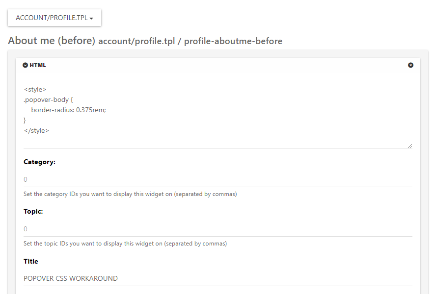
    Widgets ACP/HTML Widget Footer Logo <center> <br><br> <img id="thislogo" src="path/to/my/image"> </center> Widget Welcome Message <!-- IF loggedIn --> <div class="getUsername">, <a href="/me"><span class="username"></span></a></div> <!-- ENDIF loggedIn --> CSS

    – I added the size font-weight: 900; in the CSS because otherwise some FA icon wasn’t displayed correctly and reduce margin :

    i#thisicon { font-family: "Font Awesome 5 Free"; font-style: normal; margin-right: 8px; font-weight: 900; } .getUsername { padding-top: 20px; text-align: right; } /*Smartphone*/ /*On désactive le message de bienvenue"*/ /*We disable the welcome message"*/ @media all and (max-width: 1024px) { .getUsername { display: none; } } JAVASCRIPT // ------------------------------------------ // Welcome Message avec icône et Footer logo // Welcome Message with icon and Footer logo // ------------------------------------------ $(window).on('action:ajaxify.end', function (data) { //On récupère le username dans le DOM et on l'affiche //We retrieve the username from the DOM and display it function updateUsername() { $('.getUsername .username').text(app.user.username); } if (document.readyState === 'loading') { document.addEventListener('DOMContentLoaded', updateUsername); } else { updateUsername(); } //On déclare les variables principales (themessage & thehours) ainsi que les variables secondaires correspondants aux plages horaires //We declare the main variables (themessage & thehours) as well as the secondary variables corresponding to the time slots var thehours = new Date().getHours(); var themessage; var wakeup = ('Good day'); var morning = ('Good morning'); var lunch = ('Bon appétit'); var afternoon = ('Good afternoon'); var drink = ('Cheers'); var evening = ('Good evening'); var night = ('Good night'); var welcome = ('Welcome'); var matched = false; //On peux ici tester le résultat du code en spécifiant une heure (!!!IMPORTANT: Commenter une fois le script testé!!!) //Here we can test the result of the code by specifying a time (!!!IMPORTANT: Comment once the script has been tested!!!) //thehours = 20 //On déclare les plages horaires avec les icones FA et les logos //We declare the time slots with FA icons and logos path if (thehours >= 0 && thehours < 6) { themessage = night; theicon = "fa-solid fa-moon"; thelogo = "/assets/customlogo/XXX.png"; } else if (thehours >= 6 && thehours < 8) { themessage = wakeup; theicon = "fa-solid fa-mug-hot"; thelogo = "/assets/customlogo/XXX.png"; } else if (thehours >= 8 && thehours < 12) { themessage = morning; theicon = "fa-solid fa-sun"; thelogo = "/assets/customlogo/XXX.png"; } else if (thehours >= 12 && thehours < 13) { themessage = lunch; theicon = "fas fa-hamburger"; thelogo = "/assets/customlogo/XXX.png"; } else if (thehours >= 13 && thehours < 16) { themessage = afternoon; theicon = "fa-solid fa-sun"; thelogo = "/assets/customlogo/XXX.png"; } else if (thehours >= 16 && thehours < 18) { themessage = welcome; theicon = "fa-solid fa-rocket"; thelogo = "/assets/customlogo/XXX.png"; } else if (thehours >= 18 && thehours < 19) { themessage = drink; theicon = "fa-solid fa-wine-glass"; thelogo = "/assets/customlogo/XXX.png"; } else if (thehours >= 19 && thehours < 20) { themessage = lunch; theicon = "fas fa-pizza-slice"; thelogo = "/assets/customlogo/XXX.png"; } else if (thehours >= 20 && thehours < 24) { themessage = evening; theicon = "fa-solid fa-tv"; thelogo = "/assets/customlogo/XXX.png"; } // Si la page active est un topic, on désactive/cache le message de bienvenue // If the active page is a topic, we deactivate/hide the welcome message if (window.location.href.indexOf("topic") > -1) { console.log("This is a topic, so hide the user welcome message"); $('#thisuser').hide(); } // Sinon, on affiche le message en fonction, l'icone FA et son emplacement (prepend) // Otherwise, we display the message in function, the FA icon and its location (prepend) else { $('.getUsername').prepend("<i id='thisicon' class='" + theicon + "'></i>" + themessage); $("#thislogo").attr("src", thelogo); //$('.getUsername').prepend("<img id='thisicon' src='" + thelogo + "'></>" + themessage); } });
  • 9 Votes
    47 Posts
    4k Views

    @phenomlab said in RSS parser script [NodeBB]:

    @jac Not yet. Sorry. Have some other work commitments I need to prioritise. Hoping to get to this over the weekend.

    No worries at all mate, thanks 👍🏻

  • 0 Votes
    3 Posts
    690 Views

    Closing this thread as a duplicate of https://sudonix.com/topic/12/nodebb-customisation