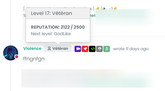
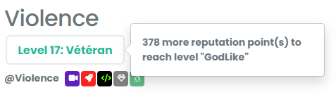
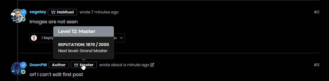
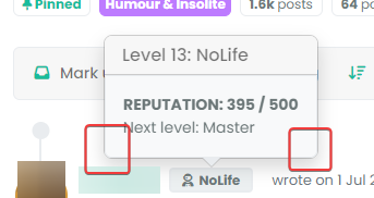
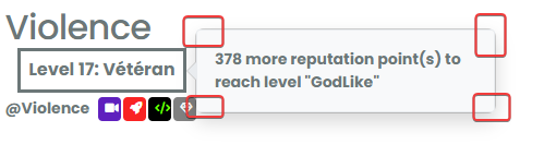
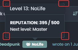
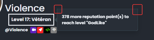
@DownPW This isn’t as simple as it looks, because bootstrap is using inset border radius
Here’s a workaround
.popover-body {
    background: var(--bs-body-bg) !important;
    color: var(--bs-body-color) !important;
    border: 1px solid var(--bs-border-color);
    border-radius: 0 0 0.375rem 0.375rem;
    margin: 0px;
}
.popover-header {
    background-color: var(--bs-alert-info-bg);
    color: var(--bs-alert-info-color);
    border-top-left-radius: 0.375rem;
    border-top-right-radius: 0.375rem;
    margin: 0px;
}
.bs-popover-auto[data-popper-placement^=top]>.popover-arrow::after, .bs-popover-top>.popover-arrow::after,{
    border-top-color: var(--bs-border-color);
}
.bs-popover-auto[data-popper-placement^=top]>.popover-arrow::after, .bs-popover-bottom>.popover-arrow::after,{
    border-bottom-color: var(--bs-border-color);
}
.bs-popover-auto[data-popper-placement^=left]>.popover-arrow::after, .bs-popover-end>.popover-arrow::after {
    border-left-color: var(--bs-border-color);
}
.bs-popover-auto[data-popper-placement^=right]>.popover-arrow::after, .bs-popover-end>.popover-arrow::after {
    border-right-color: var(--bs-border-color);
}
Then, in the widgets section - /admin/extend/widgets select the account/profile.tpl widget, and add the below HTML
<style>
.popover-body {
    border-radius: 0.375rem;
}
</style>
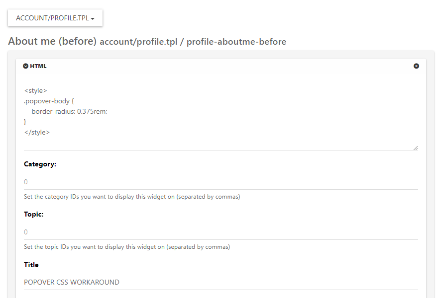
Save the widget.
This is the closest you can get unfortunately. It’s something of a hack, but a necessary evil.


")


