

@cagatay these changes aren’t published anywhere presently, so nothing for you to do.
Swatch / Theme Changer
-
Hi all,
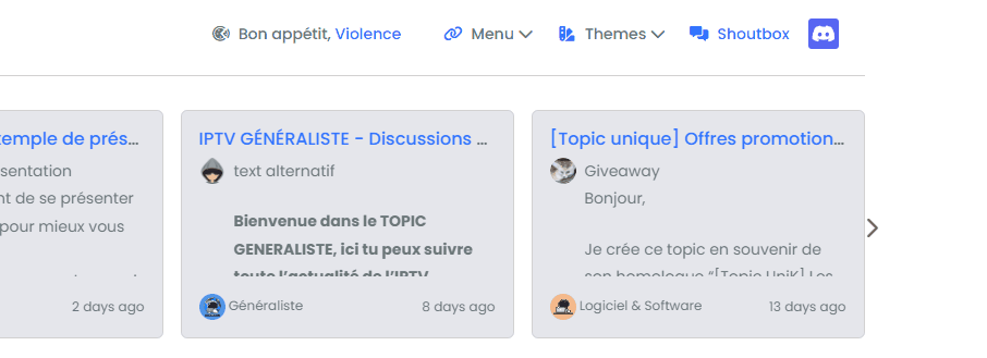
As most of you know, there is a swatch / theme switcher on this site, which can be found here
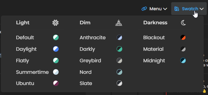
I decided to create this based on an idea from @DownPW who wanted to add theming capability to NodeBB v2.x. This started off as a relatively simple code snippet, and then over time, leveraged technologies such as Ajax etc in order to provide new features. The code is now fully mature having gone through various iterations and changes in order to make it fully compliant with BS5 and NodeBB v3.x
Let’s get started…
Disclaimer
You are strongly recommended to test this process out in a dev environment before trying it in production. Trust me, there’s nothing worse than having users ask you why things don’t look right when they access your forum, and you’d spent ages setting everything up, so do yourself a favour - if you really are intent on putting this into your own site, please test it first and get comfortable with the process before proceeding to live.
Synopsis
First and foremost, it’s worth explaining how the various elements this uses are combined to make one product.
- The Brand Header widget - this is used for the actual HTML that contains all of our selections (Light, Dim, Darkness)
- The JS code - this is placed into your ACP under
/admin/appearance/customise#custom-js. We are leveraging the already present jQuery to execute these functions - The “theme files” - these are located in your
/publicstructure inside a special folder we identify ascustomcss
All of my code is slowly moving to
gitand this particular repository can be found belowhttps://github.com/phenomlab/swatch/tree/main
JS Code
The code itself looks “complex”, but actually isn’t. You can find it here
https://github.com/phenomlab/swatch/blob/main/functions.js
You’ll need to copy all of this code, and paste it into
/admin/appearance/customise#custom-js. Don’t forget to enable this feature (see below)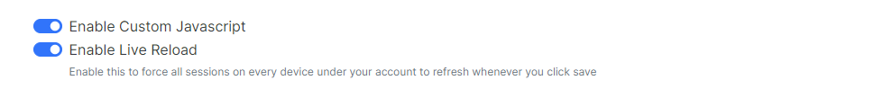
Don’t expect any miracles at this point
")
The widget code
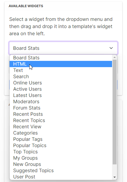
In your ACP, go to
/admin/extend/widgetsand look forBrand Header global / brand-header
Using the selectors on the right, drag the HTML widget into this area
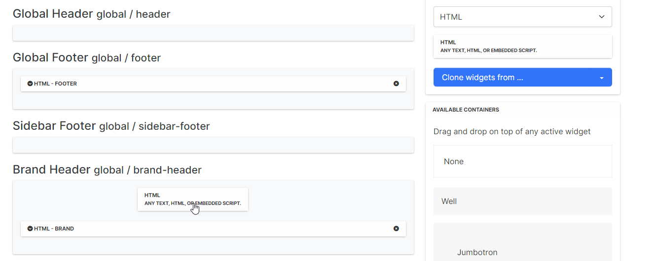
Drop it into the area shown in the screenshot. This will form the container for the HTML code we need to add, which is here
https://github.com/phenomlab/swatch/blob/main/widget.html
Copy all of the code from the link above into the widget you just created
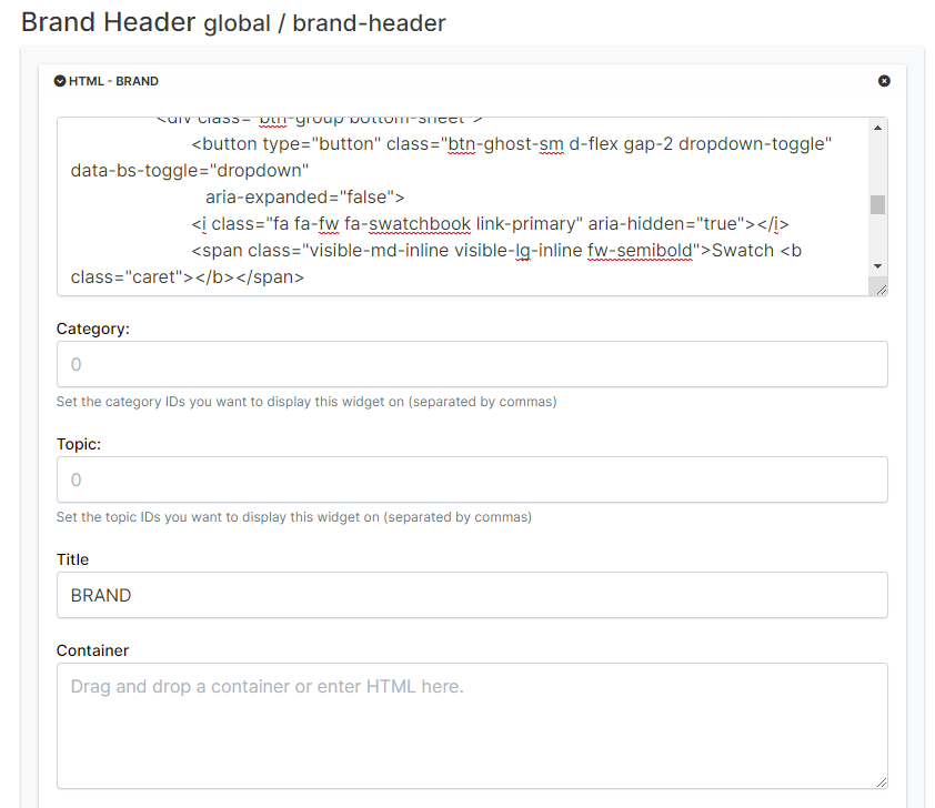
Don’t forget to save
The CSS
IMPORTANT Use of this applet requires customised CSS which can be found in the link below. You MUST replace all of your existing CSS for this to work. There are NO exceptions!
The “Global CSS” file is here
https://github.com/phenomlab/swatch/blob/main/global.css
You will need to select all of this file’s contents, and paste into
/admin/appearance/customise#custom-css- completely overwriting any custom CSS you already have. Backup your current content in case you change your mind, so you can easily revert if you decide not to use this.Why do I need to use your CSS?
You don’t, but because I make extensive use of theme variables, if you want to keep what you have now, you’re more than welcome to, but I won’t support it, and you’ll need to make hundreds of adjustments - up to you. My themes are nice though, so why not use them?
The remaining additional CSS is relatively simple, but needs to work for both desktop and mobile. It can be found here
https://github.com/phenomlab/swatch/blob/main/switcher.css
Copy all of this CSS
Now go to
/admin/appearance/customise#custom-cssand paste the CSS into the resulting window at the end of the existing CSS you created above. Again, make sure these are set to on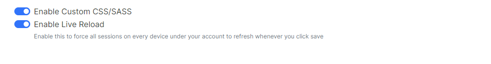
CustomCSS folder
This part is without doubt the most important, and nothing will work without these.
https://github.com/phenomlab/swatch/tree/main/customcss
Copy the main directory from the link above and it’s files to your web server, into
/nodebb/public(wherever your NodeBB installation resides). You should land up with a folder that when accessed contains all of the files.There are two components to the customcss folder. The most obvious is the CSS files, but inside this folder is a sub-folder called “editors”. This contains CSS files from
highlight.jswhich is used for code syntax in NodeBB. You can get your own themes herehttps://highlightjs.org/static/demo/
Inside the main CSS files, we “import” the editor CSS we want - for example

Make sure the permissions you set for these newly imported files match what you are using for NodeBB.
If everything went to plan, then you should have a functional swatch applet / theme switcher. You may need to clear the cache etc if you are using Cloudflare.
Any issues, let me know.
-
 undefined phenomlab referenced this topic on
-
Clean and understandable tutorial as usual.
Already in place for some time since I’ve been working with it for several months
")
Not unhappy to have found this idea of color representation for each theme
-
@DownPW Can’t beat a demo - thanks!
-

-
undefined phenomlab referenced this topic on
-
After importing the css, there is a problem with the icons, are other icon packages being used, and how can I change the icons to restore the defaults?
-
@veronikya yeah, that’s going to because I am using Font Awesome Pro.
- Search the CSS for
Font Awesome Proand replace withFont Awesome Free. - Search for
font-weight: 400;and replace withfont weight: 900;(but only in the places where Font Awesome is defined as thefont-family)
I’ll update the code tomorrow. Apologies
EDIT - CSS file has been updated
- Search the CSS for
-
The theme seems to flicker when the client first opens or jumps to a page, I think it could be put directly into the skin customization of 2.3.2 and loaded on the server, I’ll give it a try!
-
@veronikya it might flicker on load, yes, and that’s normal. It’s because the CSS and JS are loaded before the custom elements, but it shouldn’t be too bad on reasonable links.
It shouldn’t flicker at all navigating through the site though as the CSS and JS are already loaded.
-
-
-
-
-
-
-
NodeBB templates
Locked Chitchat