Skip to content

Custom badges

Solved Customisation
  • @crazycells Yes, I think I probably will.

  • @crazycells Ok, so, I found some time to look at this properly today.
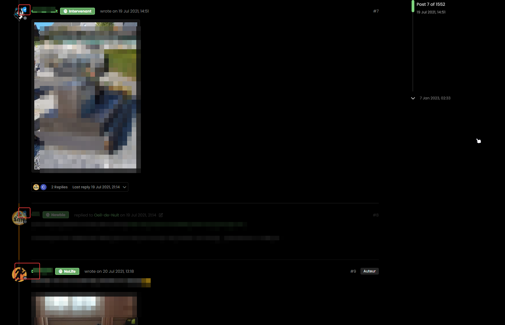
    Here’s the result

    d735ea48-7d38-444f-9e8b-822196b3c877-image.png

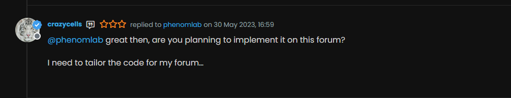
    Notice the “Twitter-esque” verified badge?

    I found this

    https://commons.wikimedia.org/wiki/File:Twitter_Verified_Badge.svg and downloaded it, then uploaded it to /assets/public/images

    Then, I used the below CSS code

        li[component="post"] a[href*="/groups/verified"] {
            position: absolute !important;
            left: 2px;
            z-index: 2;
            margin-top: 1px;
            border-radius: 999px !important;
            line-height: 14px;
            display: block;
            height: auto;
            margin-left: 0px !important;
            background: transparent !important;
            width: auto;
        }
    
        li[component=post] a[href*="/groups/verified"]:before {
            background: url(https://sudonix.org/assets/images/Twitter_Verified_Badge.svg) !important;
            content: "";
            height: 22px;
            width: 22px;
            display: block;
        }
        li[component=post] a[href*="/groups/verified"]:after {
            background: #ffffff !important;
            height: 9px;
            width: 9px;
            content: "";
            display: block;
            top: 10px;
            position: absolute;
            z-index: -1;
            left: 12px;
        }
    

    Some points to consider

    • The CSS code extensively uses :before and :after pseudo elements. Essentially, :before adds the SVG icon and positions it, and :after adds a smaller “white square” which is conveniently positioned behind the :before element using z:-index: -1;

    The purpose of the “white square” is to provide a dirty way to fill in the transparency which is present in the SVG so it looks right.

    This is pretty tough to display on mobile viewports, so it’s best to hide it completely using this code

    @media (max-width: 767px) {
        li[component="post"] a[href*="/groups/verified"].badge, .account a[href*="/groups/verified"].badge {
                display: none !important;
            }
    

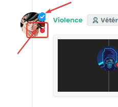
    EDIT: Just realised that this icon (being a group) is also displayed on the user’s profile page, so we’ll need CSS to make that look good too…

    7744fb9d-2994-4159-9732-d4a717511af0-image.png
    I’ve absolutely no idea who this guy is… 🙂

    Here it is

        .account a[href*="/groups/verified"] {
            position: absolute !important;
            z-index: 2;
            background: transparent !important;
            margin-left: -10px;
        }
        .account a[href*="/groups/verified"]:after {
            background: #ffffff !important;
            height: 9px;
            width: 10px;
            content: "";
            display: block;
            top: 10px;
            position: absolute;
            z-index: -1;
            left: 12px;
        }
        .account a[href*="/groups/verified"]:before {
            background: url(https://sudonix.org/assets/images/Twitter_Verified_Badge.svg) !important;
            content: "";
            height: 22px;
            width: 22px;
            display: block;
        }
    

    Enjoy.

  • hello @phenomlab

    I am trying to apply your code for the “all” group which all my members are part of.

    43c6f309-bbfe-41ae-891b-b52a28d04fdd-image.png

    I downlaod the image of the twitter badge in full resolution and upload in the same place and I access it correctly.

    On the other hand it would seem that the badge is displayed badly (cut on the right for the first on the screen) then transparent for the second and on the 3rd it is not displayed aps.

    An idea ?

    image.png

  • @DownPW it’s really hard to see that image. I’ll need to look at your dev server directly to see what’s happening here.

  • I just found some answers @phenomlab

    It is absolutely necessary that the user is displaying the badge of the group in his profile:

    18ac2ada-5234-4848-a00b-59e6d3ef1116-image.png

    That the question, How to force put the user in a group ?
    For the rest of the display bugs, I have not yet found.

  • @DownPW said in Custom badges:

    It is absolutely necessary that the user is displaying the badge of the group in his profile:

    Yes, it won’t display without that. I don’t know of a way to force it either.

  • If I apply light themes we see better.
    In fact, ther badge is cut on the right and we have the dexcription badge below :

    image.png

  • @DownPW yes, that’s just going to be positioning. Remember we are using position: absolute; and your CSS is likely to differ so you may need to tweak the positioning slightly to suit.

  • hi @phenomlab, we should be able to download this…

    https://commons.wikimedia.org/wiki/File:Twitter_Verified_Badge.svg

    …and recolor it accordingly and upload it to the forum the same way, right? These colors are reminding everyone “twitter” , I believe it would be nicer if it is changed according to the personality of the forum, so it will look more original while maintaining “meaning”…

    I think here on this forum, “sudonix orange” color would look cooler than “twitter blue”

  • additionally, these pages need some adjustments: https://sudonix.org/user/phenomlab

    Screen Shot 2023-07-13 at 14.55.20.png

  • @crazycells that’s odd. Shouldn’t look like that (at least, it doesn’t on my device). What device are you using?

  • @crazycells hmm. That’s a good idea. Let me have a look at that.

  • I had already reported this little problem to you @phenomlab

    The problem only occurs on the profile of other users and not on his own profile. (of memories)

    For my part, I solved this bug with the following code (to be adapted)

    /*----------------------------------------------------------------------------*/
    /*-------------------      USER PROFILE ANIMATION     ------------------------*/
    /*----------------------------------------------------------------------------*/
    
    /*[component="profile/change/picture"] img {
        z-index: 300 !important;
    }*/
    
    
    .avatar-wrapper:before {
        animation-iteration-count: infinite;
        animation: pulsate 4s ease-out infinite;
        border-radius: 50%;
        border: 15px solid var(--bs-link-color);
        content: "";
        height: 180px;
        left: -19px;
        top: -19px;
        opacity: 0;
        position: absolute;
        width: 180px;
        z-index: -1;
    }
    
    /* Change z-index Cover img profile for animation effect */
    .cover, .cover>.container {
        z-index: -2;
    }
    
    /* Avatar on user profile page */
    .account .avatar-wrapper {
        /* border: 4px solid var(--bs-link-color); */
        margin-right: 20px;
    }
    
  • @DownPW yes, I remember, but anything that uses absolute positioning will always be problematic when it comes to dynamically placing elements when the browser window is resized.

    I have another idea which I’m going to try. If that doesn’t work, I’ll likely remove this altogether.

  • @DownPW yeap, you are absolutely right. I have just checked, it is not on my profile, but anyone else…

  • @crazycells This proved to be much harder than I anticipated. The issue here is that the background is already transparent, so if you make the rosette itself transparent, you can no longer use the :after element as it’s designed to fill in the check mark - not the remainder of the image.

    The only real way this would be possible and without losing yourself in overlapping CSS code would be to edit the image with Illustrator, or InkScape (Open Source) and change the rosette and border colour according to taste.

    Ultimately, it’s not possible to change this on the fly using CSS without significant work. As a result of this, plus your idea yesterday, I have elected to use a Font Awesome icon (Shield with Check Mark) and have made it “Sudonix Orange”.

  • @DownPW so me a favor, and let me know if the CSS you provided works as expected when browsing users as a guest? I’m not using the same CSS, but a slightly modified version.

    Interested to get other experiences.

  • @phenomlab thanks for the explanation. I assumed it would not be easy, and additionally, if it is easy for you, it was going to be harder for me… since it is already hard for you, I give up 😄

    by the way, I was referring to the orange color in your logo, but I see that the stars are “sudonix orange” and the checkmark is changing depending on the theme you are in…

    But in any case, I believe these more “coherent” colors definitely look better than the previous version… 👍

  • @crazycells yes, I noticed that too. It’s because that specific element uses the link color variable which changes with the theme. I need to create a static entry for that as it’s not intended behavior.

  • @phenomlab in any case, it looks better than yesterday though 🙂


Did this solution help you?
Did you find the suggested solution useful? Why not buy me a coffee? It's a nice gesture, and a great way to show your appreciation 💗

  • 1 Votes
    1 Posts
    111 Views
    No one has replied
  • 2 Votes
    26 Posts
    1k Views

    @Panda said in Interesting Widget code, but can’t fetch API:

    How did you drop that widget into the post there?
    I hadnt seen this BSgenerator anywhere on sudonix site, do you use it somewhere already?

    Yes, here

    https://sudonix.org/topic/414/corporate-bullshit-generator?_=1687774393044

    It’s not a “post” or “topic” in the common sense. It is actually a page in it’s own right and leverages nodebb-plugin-custom-pages. This in turn creates a new “route” which behaves like a page, meaning it is then exposed for widgets.

    @Panda said in Interesting Widget code, but can’t fetch API:

    Also can you explain more what you mean by calling the code externally. In my API call example, how would I go about doing that?

    By this, I mean create all the required code in an external JS file that is reachable by the NodeBB instance - so, in “public” for example - or in my case /public/js. The widget then “calls” that file and because it runs outside of the scope of NodeBB, you just need to return the values to the widget.

    Hope this makes sense?

  • Composer Zen icon?

    Solved Configure
    8
    2 Votes
    8 Posts
    207 Views

    @DownPW exactly. Not really a new concept, and in all honesty, not something I’ve ever used.

    If you consider the need to add links and references, or citations, you’d need to be able to see other parts of the screen!

  • NodeBB: Creating pages

    Solved Configure
    9
    0 Votes
    9 Posts
    277 Views

    OK, I think I have figured out how to place a link in the footer which will click to a new page.

  • 1 Votes
    2 Posts
    262 Views

    @Sala This should look better

    .sidenav .navbar-brand { padding-top: 0.5rem; padding-bottom: 0.5rem; }

    e5cec20e-be36-4ee8-9129-fd11ad4656ac-image.png

    You can increase the top and bottom padding by increasing the values above.

  • 5 Votes
    3 Posts
    375 Views

    @phenomlab

    I love it too

    @phenomlab said in Blinking text Effect:

    Has that “broken neon light” look that you see in films.

    It’s exactly that, kind of old neon signs of bar or pubs a bit cyberpunk too 😉

  • Fontawesome 5

    Unsolved Customisation
    14
    1 Votes
    14 Posts
    680 Views

    @pwsincd hi. Just following up on this thread (I know it’s old) but was curious to understand if it’s still an issue or not ?

  • 38 Votes
    193 Posts
    29k Views

    OMG make sense

    Thanks dude 🙂