Skip to content

ineffecient use of space on mobile

Solved Customisation
  • Hi @phenomlab ,

    When I access these pages that show posts on mobile:

    /posts
    /best
    /controversial

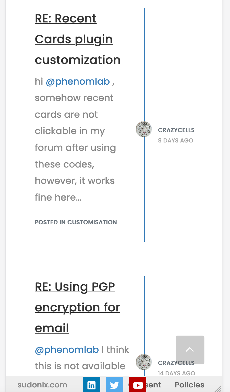
    I see something like this:
    Screen Shot 2022-05-12 at 1.11.28 PM.png

    This is how it looks on default. Our forum is the same, NodeBB community forum is the same…

    Although this page design does not bother me on desktop, I feel on mobile ~40% of the page is wasted for space…

    1. I wonder your opinion about this.

    2. Do you think these pages can be re-designed with CSS codes?

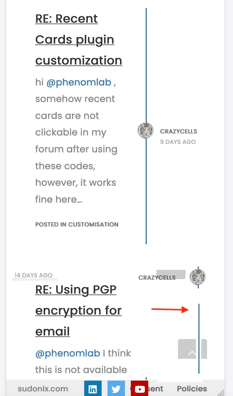
    I thought something like this, as in the topics… so, the blue line and avatar goes to the right side edge… username comes next to avatar, date goes to the left side… And of course “the post area” will be expanded to whole page…

    Screen Shot 2022-05-12 at 1.11.28 PM copy.jpg

  • @crazycells I knew that was coming 😄 - here it is

    @media (max-width: 767px) {
    .posts-list .posts-list-item {
        width: auto;
    }
    .posts-list .posts-list-item .post-body {
        border-right: none !important;
        width: 100%;
    }
    .posts-list .posts-list-item .post-info {
        position: revert;
        left: 0px;
        width: 500px;
    }
    .posts-list .posts-list-item .post-info .post-author {
        max-width: none !important;
        display: flex;
    }
    .posts-list .posts-list-item .post-info .post-author span {
        margin-left: 10px;
    }
    }
    

    Some other adjustments to get even more estate on mobile (30px either side) - your tastes may vary

    @media (max-width: 767px) {
    .posts-list .posts-list-item {
        width: auto;
    }
    .posts-list .posts-list-item .post-info {
        position: revert;
        left: 0px;
        width: 100%;
        margin-left: 15px;
    }
    .posts-list .posts-list-item .post-info .post-author {
        max-width: none !important;
        display: flex;
    }
    .posts-list .posts-list-item .post-body {
        border-right: none !important;
        width: 100%;
    }
    .posts-list .posts-list-item .post-info .post-author span {
        margin-left: 10px;
    }
    }
    

    The second CSS block gives you this

    1a9607f4-c011-4521-ba7b-e1b5fe44a045-image.png

    A final note that this of course does not include the colour scheme. This is from “Midnight” - a new theme I’ve developed in DEV which is almost ready for release, but has a few bugs I need to iron out first. I’ll publish a blog post on this new theme set soon.

  • @crazycells Funny you should mention that ! I was looking at this in my DEV environment yesterday and decided to alter the layout a bit

    bae79dbc-d2ef-4ceb-b25b-1bbcc24561bd-image.png

    My personal thoughts are that this looks much better and is easier to read 🙂

  • @phenomlab said in ineffecient use of space on mobile:

    @crazycells Funny you should mention that ! I was looking at this in my DEV environment yesterday and decided to alter the layout a bit

    lol, let’s say “great minds think alike” 😄

  • @phenomlab yes, I think this is definitely way better than the current form…

    Is this all CSS? or have you changed the codes in files as well?

  • @crazycells It’s all CSS !

  • @phenomlab said in ineffecient use of space on mobile:

    @crazycells It’s all CSS !

    great. Can you please share it when it is ready? I am looking forward to it.

    I have realized this recently, after using “/best-posts” plugin… it is very hard to follow these posts on mobile…

  • @crazycells I knew that was coming 😄 - here it is

    @media (max-width: 767px) {
    .posts-list .posts-list-item {
        width: auto;
    }
    .posts-list .posts-list-item .post-body {
        border-right: none !important;
        width: 100%;
    }
    .posts-list .posts-list-item .post-info {
        position: revert;
        left: 0px;
        width: 500px;
    }
    .posts-list .posts-list-item .post-info .post-author {
        max-width: none !important;
        display: flex;
    }
    .posts-list .posts-list-item .post-info .post-author span {
        margin-left: 10px;
    }
    }
    

    Some other adjustments to get even more estate on mobile (30px either side) - your tastes may vary

    @media (max-width: 767px) {
    .posts-list .posts-list-item {
        width: auto;
    }
    .posts-list .posts-list-item .post-info {
        position: revert;
        left: 0px;
        width: 100%;
        margin-left: 15px;
    }
    .posts-list .posts-list-item .post-info .post-author {
        max-width: none !important;
        display: flex;
    }
    .posts-list .posts-list-item .post-body {
        border-right: none !important;
        width: 100%;
    }
    .posts-list .posts-list-item .post-info .post-author span {
        margin-left: 10px;
    }
    }
    

    The second CSS block gives you this

    1a9607f4-c011-4521-ba7b-e1b5fe44a045-image.png

    A final note that this of course does not include the colour scheme. This is from “Midnight” - a new theme I’ve developed in DEV which is almost ready for release, but has a few bugs I need to iron out first. I’ll publish a blog post on this new theme set soon.

  • @phenomlab said in ineffecient use of space on mobile:

    @crazycells I knew that was coming - here it is

    lol of course 😄

    Thanks a lot. It is definitely much better than the previous version…

    Since we have not adapted posts as boxes yet, I would like to separate the posts by a line from edge to edge… but not sure what classes should I use? I know the code will be something like this:

    .posts-list .posts-list-item .post-info {
    border-bottom: 1px solid #000;
    }
    

    but this does not extend from edge to edge. Do you have any other suggestions to separate posts from each other?

    Actually, it looks good when I add:

        margin-bottom: 35px;
    

    but, I wanted to ask in case you have a better solution.

  • @crazycells This is fine. The generally accepted way of adding a space between elements is to use margin so you’re on the right track.

  • phenomlabundefined phenomlab has marked this topic as solved on
  • crazycellsundefined crazycells referenced this topic on

Did this solution help you?
Did you find the suggested solution useful? Why not buy me a coffee? It's a nice gesture, and a great way to show your appreciation 💗

  • Nodebb design

    Solved General
    2
    1 Votes
    2 Posts
    146 Views

    @Panda said in Nodebb design:

    One negative is not being so good for SEO as more Server side rendered forums, if web crawlers dont run the JS to read the forum.

    From recollection, Google and Bing have the capability to read and process JS, although it’s not in the same manner as a physical person will consume content on a page. It will be seen as plain text, but will be indexed. However, it’s important to note that Yandex and Baidu will not render JS, although seeing as Google has a 90% share of the content available on the web in terms of indexing, this isn’t something you’ll likely lose sleep over.

    @Panda said in Nodebb design:

    The “write api” is preferred for server-to-server interactions.

    This is mostly based around overall security - you won’t typically want a client machine changing database elements or altering data. This is why you have “client-side” which could be DOM manipulation etc, and “server-side” which performs more complex operations as it can communicate directly with the database whereas the client cannot (and if it can, then you have a serious security flaw). Reading from the API is perfectly acceptable on the client-side, but not being able to write.

    A paradigm here would be something like SNMP. This protocol exists as a UDP (UDP is very efficient, as it is “fire and forget” and does not wait for a response like TCP does) based service which reads performance data from a remote source, thus enabling an application to parse that data for use in a monitoring application. In all cases, SNMP access should be “RO” (Read Only) and not RW (Read Write). It is completely feasible to assume complete control over a firewall for example by having RW access to SNMP and then exposing it to the entire internet with a weak passphrase.

    You wouldn’t do it (at least, I hope you wouldn’t) and the same ethic applies to server-side rendering and the execution of commands.
  • 3 Votes
    16 Posts
    490 Views

    @phenomlab
    Ah, got it working!
    I reversed the CSS addition to put z index high, and then I could see another error box saying fork title must be at least 3 characters.
    So made the new fork title longer and button responded.

  • 2 Votes
    26 Posts
    1k Views

    @Panda said in Interesting Widget code, but can’t fetch API:

    How did you drop that widget into the post there?
    I hadnt seen this BSgenerator anywhere on sudonix site, do you use it somewhere already?

    Yes, here

    https://sudonix.org/topic/414/corporate-bullshit-generator?_=1687774393044

    It’s not a “post” or “topic” in the common sense. It is actually a page in it’s own right and leverages nodebb-plugin-custom-pages. This in turn creates a new “route” which behaves like a page, meaning it is then exposed for widgets.

    @Panda said in Interesting Widget code, but can’t fetch API:

    Also can you explain more what you mean by calling the code externally. In my API call example, how would I go about doing that?

    By this, I mean create all the required code in an external JS file that is reachable by the NodeBB instance - so, in “public” for example - or in my case /public/js. The widget then “calls” that file and because it runs outside of the scope of NodeBB, you just need to return the values to the widget.

    Hope this makes sense?

  • 1 Votes
    1 Posts
    278 Views
    No one has replied
  • 0 Votes
    2 Posts
    156 Views

    @eeeee they are nothing to worry about, and can be ignored.

  • NodeBB inline videoplayer

    Solved Customisation
    12
    3 Votes
    12 Posts
    714 Views

    @phenomlab
    YAY! It works
    Thanks so much

  • 0 Votes
    9 Posts
    804 Views

    @downpw I’m inclined to agree with this. There isn’t much else you can do, and provided it works with no odd looking artefacts in other browsers, then ok. The :before and :after are pseudo classes and very well supported across all browsers (except perhaps Internet Exploder, but who uses that these days ?)

  • 12 Votes
    47 Posts
    2k Views

    @phenomlab I’m really looking forward to trying out ghost fairly soon. Should I underestimate the fact I’m not a writer? 😉.