Skip to content

hover link effect

Solved Customisation
  • Hello @phenomlab

    I see this effect on link here.

    64ce4a20-4dbf-468f-9180-38e657810970-image.png

    I research how to do this or other effect and i found this code for example on css tricks

    a {
      position: relative;
    }
    
    a::before {
        content: '';
        position: absolute;
        width: 100%;
        height: 2px;
        border-radius: 2px;
        background-color: red;
        bottom: 0;
        left: 0;
        transform-origin: right;
        transform: scaleX(0);
        transition: transform .3s ease-in-out;
      }
    
    a:hover::before {
        color: red;
      transform-origin: left;
      transform: scaleX(1);
    }
    
    a:focus, a:hover {
        color: red;
    }
    

    The effect is good but he is active on reply button, quote, reply to, username and I don’t want that… Just on post (url, @mention)

    And you, what is your code ?

  • @DownPW

    reply to me, maybe .posts .content a:focus

    I will test 😉

  • @DownPW I also had some issues with this effect showing on unwanted elements, and off the top of my head I can’t recall the CSS I used, but will check.

  • @phenomlab

    .posts .content seems to be pretty good for me 😉

  • @DownPW said in hover link effect:

    @phenomlab

    .posts .content seems to be pretty good for me 😉

    it not worked on my web site.

  • @DownPW My CSS is as below

    .content p a:not(.noanimate):after {    
      background: none repeat scroll 0 0 transparent;
      bottom: 0;
      content: "";
      display: block;
      height: 1px;
      left: 0%;
      position: absolute;
      background: var(--link);
      transition: width 0.3s ease 0s, left 0.3s ease 0s;
      width: 0;
    }
    .content p a:hover:after { 
      width: 100%; 
      left: 0; 
    }
    
  • @phenomlab

    And here is mine with mirror effect on the text (for default theme) 😉

    .posts .content a {
      background-image: linear-gradient(to right, #54b3d6, #54b3d6 50%, #337ab7 50%);
      background-size: 200% 100%;
      background-position: -100%;
      display: inline-block;
      padding: 5px 0;
      position: relative;
      -webkit-background-clip: text;
      -webkit-text-fill-color: transparent;
      transition: all 0.3s ease-in-out;
    }
    
    .posts .content a:before {
      content: '';
      background: #54b3d6;
      display: block;
      position: absolute;
      bottom: 1px;
      left: 0;
      width: 0;
      height: 1px;
      transition: all 0.3s ease-in-out;
    } 
    
    .posts .content a:hover {
     background-position: 0;
    }
    
    .posts .content a:hover::before{
      width: 100%;
    }
    
  • DownPWundefined DownPW has marked this topic as solved on
  • With my code the only problem is I have the same effect on images (on mouse hover) that contain a url.

    Do you have a solution to fix this @phenomlab ?

  • @DownPW I had exactly the same issue. Before I provide my solution, from recollection, you are using Fancybox ?

  • @DownPW in that case, you’ll need to add the below jQuery function just after the one you should already have

        $(window).on('action:posts.loaded', function(data) {
            console.log("Polling DOM for lazyLoaded images to apply Fancybox");
            $(document).ready(function() {
                $('a').not('.forum-logo').not(".avatar").not(".emoji").not(".bmac-noanimate").each(function() {
                    $('a[href*=".jpg"], a[href*=".jpeg"], a[href*=".png"], a[href*=".gif"], a[href*=".webp"]').addClass("noanimate");
                });
            });
        });
    

    What we are doing here is polling the DOM looking for any new images as posts are being loaded (hence the hook action:posts.loaded, and then it we get a match, we add new class .noanimate. You’ll need to modify your existing class block you are using for the hover effect so that it is not being executed against any HTML that contains this class - see below for an example (in your use case)

    .posts .content a:not(.noanimate) {
      background-image: linear-gradient(to right, #54b3d6, #54b3d6 50%, #337ab7 50%);
      background-size: 200% 100%;
      background-position: -100%;
      display: inline-block;
      padding: 5px 0;
      position: relative;
      -webkit-background-clip: text;
      -webkit-text-fill-color: transparent;
      transition: all 0.3s ease-in-out;
    }
    
  • @phenomlab

    Thanks dude I will test that

  • @phenomlab said in hover link effect:

    .posts .content a:not(.noanimate) {
    background-image: linear-gradient(to right, #54b3d6, #54b3d6 50%, #337ab7 50%);
    background-size: 200% 100%;
    background-position: -100%;
    display: inline-block;
    padding: 5px 0;
    position: relative;
    -webkit-background-clip: text;
    -webkit-text-fill-color: transparent;
    transition: all 0.3s ease-in-out;
    }

    it’s worked, thank you.

  • Hello ✋

    I play with URL/Link CSS Trick for topic on nodebb V3

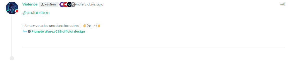
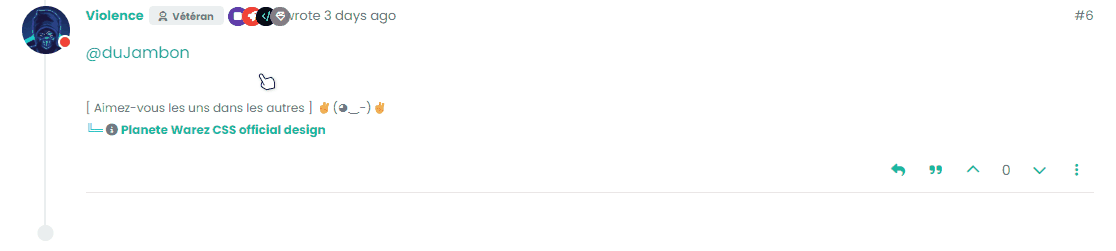
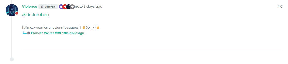
    Here are 3 effects I love that I share with you I love the first one and I think it’s the one I’d keep in production.

    – Style 1 :

    test.gif

    .posts .content a {
        box-shadow: inset 0 0 0 0 var(--bs-link-color);
        color: var(--bs-link-color);
        padding: 0 .25rem;
        margin: 0 -.25rem;
        transition: color .3s ease-in-out, box-shadow .3s ease-in-out;
        border-radius: 0.5rem;
    }
    
    .posts .content a:hover {
        color: #fff;
        box-shadow: inset 200px 0 0 0 var(--bs-link-color);
        border-radius: 0.5rem;
    }
    
    .posts .content a:hover::before{
        width: 100%;
    } 
    

    – Style 2 :

    test2.gif

     .posts .content a {
        color: var(--bs-link-color);
        background-image: linear-gradient(to right, var(--bs-link-color), var(--bs-link-color) 50%, var(--bs-link-hover-color) 50%);
        background-size: 200% 100%;
        background-position: -100%;
        display: inline-block;
        padding: 5px 0;
        position: relative;
        -webkit-background-clip: text;
        -webkit-text-fill-color: transparent;
        transition: all 0.3s ease-in-out;
    }
    
    .posts .content a:hover {
     background-position: 0;
    }
    
    .posts .content a:hover::before{
        width: 100%;
    }
    

    – Style 3 :

    test3.gif

    .posts .content a {
        color: var(--bs-link-color);
        text-decoration: none;
        background: linear-gradient(to right, var(--bs-link-color), var(--bs-link-color)), linear-gradient(to right, var(--bs-link-hover-color), var(--bs-link-hover-color), var(--bs-link-hover-color));
        background-size: 100% 3px, 0 3px;
        background-position: 100% 100%, 0 100%;
        background-repeat: no-repeat;
        transition: background-size 400ms;
        padding-bottom: 3px;
    }
    
    .posts .content a:hover {
     background-size: 0 3px, 100% 3px;
    }
    
    .posts .content a:hover::before{
        width: 100%;
    }
    

    –> It’s up to you to play with colors, adapt the code to your environment etc.

    Have fun 😉

  • @DownPW these look great! Thanks for sharing.

  • @DownPW good job 🙂

  • Hello !!!

    I search to have this hover link effect on nodebb without success.
    If anyone has an idea, I’m a taker.

    go to the download button

    https://www.warp.dev

  • @DownPW Looking at the underlying code, class start is being added on hover by jQuery in this function

    
      document.querySelectorAll(".button-gradient, .button-transparent").forEach((button) => {
        const style = getComputedStyle(button);
    
        const lines = document.createElement("div");
    
        lines.classList.add("lines");
    
        const groupTop = document.createElement("div");
        const groupBottom = document.createElement("div");
    
        const svg = createSVG(
          button.offsetWidth,
          button.offsetHeight,
          parseInt(style.borderRadius, 10)
        );
    
        groupTop.appendChild(svg);
        groupTop.appendChild(svg.cloneNode(true));
        groupTop.appendChild(svg.cloneNode(true));
        groupTop.appendChild(svg.cloneNode(true));
    
        groupBottom.appendChild(svg.cloneNode(true));
        groupBottom.appendChild(svg.cloneNode(true));
        groupBottom.appendChild(svg.cloneNode(true));
        groupBottom.appendChild(svg.cloneNode(true));
    
        lines.appendChild(groupTop);
        lines.appendChild(groupBottom);
    
        button.appendChild(lines);
    
        button.addEventListener("pointerenter", () => {
          button.classList.add("start");
        });
    
        svg.addEventListener("animationend", () => {
          button.classList.remove("start");
        });
      });
    })
    

    The CSS for start is below

    .button-gradient.start .lines svg, .button-transparent.start .lines svg {
      animation: stroke 0.3s linear;
    }
    

    And this is the corresponding keyframe

    @keyframes stroke {
      30%, 55% {
        opacity: 1;
      }
      100% {
        stroke-dashoffset: 5;
        opacity: 0;
      }
    }
    

    It’s using both CSS and SVG, so might not be a simple affair to replicate without the SVG files.


Did this solution help you?
Did you find the suggested solution useful? Why not buy me a coffee? It's a nice gesture, and a great way to show your appreciation 💗

  • 7 Votes
    8 Posts
    184 Views

    @crazycells hmm. That’s odd. I haven’t made any changes from recollection but I could be wrong. I’ll need to check.

    EDIT - very strange. I honestly don’t recall adding the below CSS block to alter the bottom bar, but you’re right…

    .bottombar-nav { padding: 0px !important; }

    I’ve removed this so it reflects stock Harmony.

  • Footer bar add center text

    Solved Customisation
    41
    8 Votes
    41 Posts
    3k Views

    @phenomlab said in Footer bar add center text:

    div#console-nav-tab

    Ah ok test with bottom: 0px !important; idem

  • 2 Votes
    20 Posts
    632 Views

    @phenomlab

    grrrrrrr
    grrrrr

    that simple…

    Thanks Mark

  • 9 Votes
    32 Posts
    2k Views

    @DownPW said in Bottom footer navbar button extend:

    Oh my god, it’s beautiful mark

    I liked this design so much, I’ve implemented it here. I intend to do a lot more with the footer in due course, so hiding it makes a lot of sense. Thanks @DownPW for the idea and initial concept ♥

  • Link vs Refresh

    Solved Customisation
    20
    8 Votes
    20 Posts
    943 Views

    @pobojmoks Do you see any errors being reported in the console ? At first guess (without seeing the actual code or the site itself), I’d say that this is AJAX callback related

  • Fontawesome 5

    Unsolved Customisation
    14
    1 Votes
    14 Posts
    680 Views

    @pwsincd hi. Just following up on this thread (I know it’s old) but was curious to understand if it’s still an issue or not ?

  • 4 Votes
    25 Posts
    2k Views

    Topic open
    https://sudonix.com/topic/207/nodebb-help-for-my-custom-css

  • NodeBB Design help

    Solved Customisation
    8
    2 Votes
    8 Posts
    829 Views

    @riekmedia I’ve applied some new CSS to your site. Can you reload the page and try again ?

    For the record, this is what I added

    #footer { background: #2d343e; border-top: 4px solid #2d343e; font-size: 0.9em; margin-top: 70px; padding: 80px 0 0; position: relative; clear: both; bottom: 0; left: 0; right: 0; z-index: 1000; margin-left: -15px; margin-right: -338px; }

    The /categories page seems a bit messed up, so looking at that currently

    EDIT - issued some override CSS in the CATEGORIES widget

    <!--- CSS fix for overspill on /categories page - DO NOT DELETE --> <style> #footer { margin-right: -45px; } </style>

    That should resolve the /categories issue.