
Very good like always 😉
Material View Support for Stock NodeBB
Unsolved
Let's Build It
-
Hello @phenomlab
like thread view in topics and in Chat, I got the idea of having the same principle for the material view in the home page, the recent Topics view, unread, inside topics etc…
We could call it Material View
The idea would be to have a button in the right sidebar (User Bar) to activate the Material view or not. The container to use would therefore be [component="sidebar/right]
This should of course not interact with the Thread view mode in the topics nor with the Stock code of nodeBB
To not interfere with the other 2 codes, we could name the CSS class to add
.mviewor.materialfor exampleThis is the desired result if you activate the Material view button :
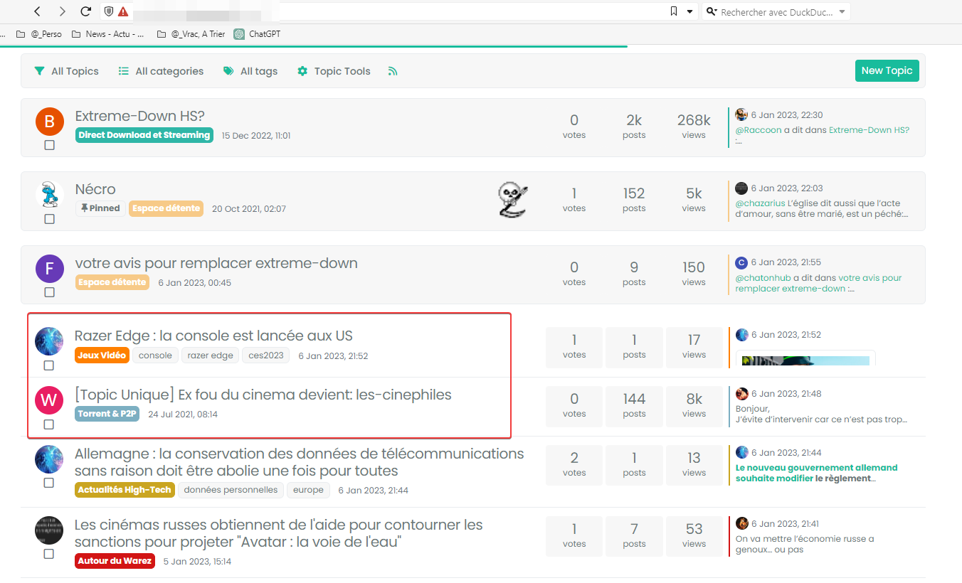
– Home Page :

– Recent, unread, etc…
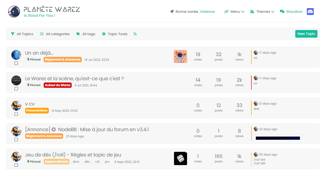
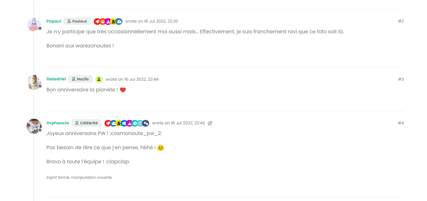
– Topic (without thread View)
Here the CSS code ofr apply this Chnage without Javascript Code, just CSS :
// ------------------------------------------
// Thread CATEGORIES & TOPIC (TEST)
// ------------------------------------------

/* Home Page and Recent */
@media (min-width: 576px) {
[component=post], [component="category/topic"], [component="categories/category"], li[component="chat/message"], [component="chat/recent/room"], div#users-container a {
    background: var(--bs-post-category-wrapper);
    background: #f7f7f7;
    border-radius: var(--bs-post-category-wrapper-radius);
    border-radius: 0.375rem;
    margin-bottom: var(--bs-post-category-wrapper-margin);
    margin-bottom: 20px;
    border: 1px solid var(--bs-border-color);
}
}

@media (min-width: 576px){
[component="category/topic"], [component="categories/category"] {
    margin-bottom: var(--bs-post-category-topic-margin);
    margin-bottom: 20px;
}
}

@media (min-width: 576px) {
ul.topics-list li, li[component="chat/message"], [component="chat/recent/room"], div#users-container a {
    padding: 0.75rem 0 !important;
    padding-left: 20px !important;
    padding-right: 20px !important;
}
}

ul.topics-list li {
    border-bottom: 1px solid var(--bs-border-color);
}

@media (min-width: 1600px) {
[component=category] > *, .categories-list > *, [component="groups/container"] > *, .users-container > * {
    transition: opacity 150ms linear 100ms, transform 150ms ease-in-out 100ms;
}
}

@media (min-width: 1600px) {
[component=category] > *, .categories-list > *, [component="groups/container"] > *, .users-container > * {
    visibility: visible;
}
}

@media (min-width: 576px) {
[component="categories/category"] {
    padding: 20px;
}
}

/* Topics & Posts */
.page-topic .topic .posts.timeline .timeline-event, .page-topic .topic .posts.timeline > [component="post/placeholder"], .page-topic .topic .posts.timeline > [component=post] {
    border-left: none;
    /*box-shadow: 0 0.5rem 1rem rgba(0, 0, 0, 0.15) !important;*/
    transition: margin-left 0.3s ease, margin-right 0.3s ease;
    border: 1px solid var(--bs-border-color);
    background: #F7F7F7;
}

.post-footer.border-bottom.pb-2 {
    border-bottom: 0rem !important;
}

li.necro-post.text-muted.timeline-event.d-flex.gap-2.pt-4 {
    box-shadow: none !important;
    border-radius: 0rem !important;
    border: none;
    background: none !important;
}

.page-topic .topic .posts.timeline .timeline-event.highlight, .page-topic .topic .posts.timeline > [component="post/placeholder"].highlight, .page-topic .topic .posts.timeline > [component=post].highlight {
    border-radius: 0.375rem;
}

@media (min-width: 1200px) {
ul[component=topic]:before {
    margin-left: 50px;
}
}


@media (min-width: 1200px) {
.posts-container:before {
    margin-left: 43px;
}
ul[component=topic]:after {
    margin-left: 43px;
}
}

@media (min-width: 576px) {
.page-topic .topic .posts.timeline [component="topic/event"].timeline-event .timeline-badge, .page-topic .topic .posts.timeline [component="topic/necro-post"].timeline-event .timeline-badge {
    margin-left: 1rem;
}
}

a.post-index.text-muted.d-none.d-md-inline {
    margin-right: 5px;
}

.page-topic .topic .posts.timeline .timeline-event:last-child, .page-topic .topic .posts.timeline>[component="post/placeholder"]:last-child, .page-topic .topic .posts.timeline>[component=post]:last-child {
    padding-bottom: 0rem;
}
– A helping hand developing this would be super cool. Unless you don’t care at all and you don’t like the idea.
– For now I have a beginning, the following code inspired by your previous codes but I don’t know if I’m on the right track
// ------------------------------------------
// material View Mode
// ------------------------------------------

function material() {
    $(document).ready(function () {
        // Check if the screen width is 460px or more
        if ($(window).width() >= 460) {
            // Check if the custom thread view button already exists
            if ($('#materialThreadViewButton').length === 0) {
                // Create the button for custom thread view mode with custom IDs
                var threadViewButton = $('<div class="material-threads-wrapper"><form class="form"><div class="form-check form-switch material-threads-wrapper"> \
                    <input class="form-check-input" id="materialThreadViewButton" type="checkbox" data-field="materialThreadView"> \
                    <label class=" d-none d-md-inline fw-semibold" for="materialThreadViewButton"></label> \
                </div></form></div>');

                // Append the button to the right sidebar
                $('[component="sidebar/right"]').append(threadViewButton);
            }

            // Check if there's a stored state for the checkbox and update it
            var storedState = localStorage.getItem('materialThreadViewState');
            if (storedState === 'true') {
                $('#materialThreadViewButton').prop('checked', true);
            }

            // Toggle the class 'material' on or off when the checkbox changes state
            $('#materialThreadViewButton').on('change', function () {
                var isChecked = $(this).is(':checked');
                var theTooltip = isChecked ? "Material Thread View Off" : "Material Thread View On"; // Update tooltip message

                // Toggle CSS rules when the button is turned on or off
                if (isChecked) {
                    console.log('Material Thread view is active.');
                    // Apply your CSS rules here
                } else {
                    console.log('Material Thread view is inactive.');
                    // Remove the CSS rules here
                }

                // Store the checkbox state in localStorage
                localStorage.setItem('materialThreadViewState', isChecked);

                // Update the tooltip title
                $(this).attr('data-original-title', theTooltip).tooltip('dispose').tooltip({
                    placement: 'bottom',
                    title: theTooltip,
                    trigger: 'hover'
                });
            });

            // Check for changes in the checkbox state when the page loads
            $('#materialThreadViewButton').trigger('change');
        }
    });
}

// Attach the material function to relevant events
$(window).on('action:ajaxify.end', function (data) {
    material();
});

$(window).on('action:posts.edited', function (data) {
    material();
});

$(window).on('action:posts.loaded', function (data) {
    material();
});
– Here the result :
-
@DownPW don’t care? Are you nuts? I absolutely love this idea! Let me review and get back to you.
-
Ha ha !!!
In any case my code does not work correctly
")
-
@DownPW nothing we can’t fix. Let me fire this up in dev and have a look.
-
@DownPW can you provide a screenshot of the layout you have? This would be useful as a guide.
-
– Home Page :
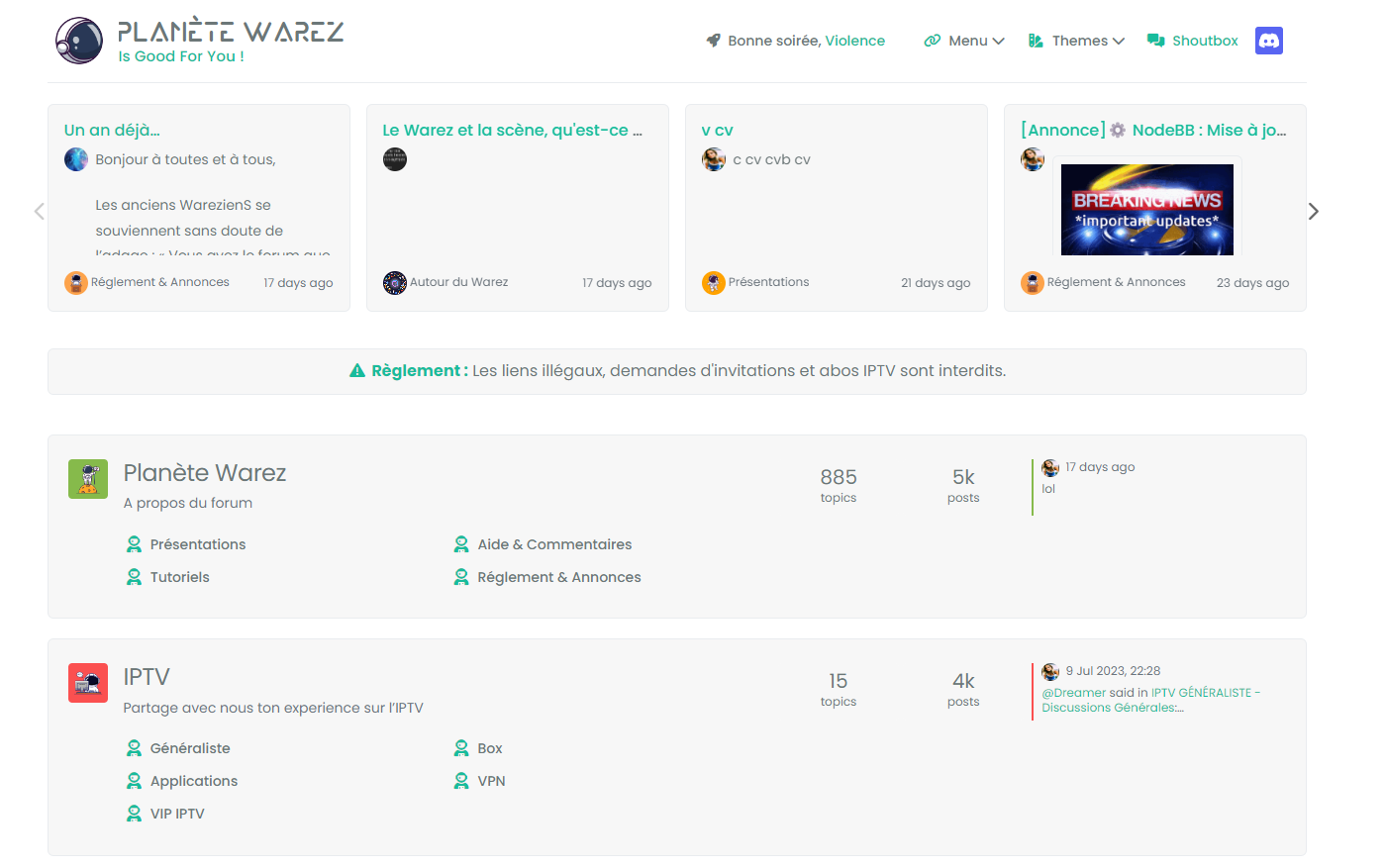
– Recent, unread, etc…

– Topic (without thread View)

-
It seems that the CSS class is added but that it does not work correctly when declared in the ACP.
I wonder if we should not remove the resolution story and have the code applied regardless of the resolution used because Material mode can very well be used on Smartphones.
-
@DownPW On reviewing the screenshots again, this seems to be only an adjustment for the overall container width?
-
just background color, border etc…
You have CSS I used for this result above in the topicbut anyway, my code is not correct.
-
@DownPW It doesn’t work because you haven’t defined anything here
                // Toggle CSS rules when the button is turned on or off
                if (isChecked) {
                    console.log('Material Thread view is active.');
                    // Apply your CSS rules here
                } else {
                    console.log('Material Thread view is inactive.');
                    // Remove the CSS rules here
                }
This is how I do it for the threads
Your CSS also needs to be more explicit. For example
[component="category/topic"], [component="categories/category"] {
    margin-bottom: var(--bs-post-category-topic-margin);
    margin-bottom: 20px;
}
Would become
[component="category/topic"].material, [component="categories/category"].material { margin-bottom: var(--bs-post-category-topic-margin); margin-bottom: 20px; } -
I remenber I have already test this without good result.
Maybe retest
-
@DownPW Did you review the classes as I mentioned?
-
@phenomlab said in Material View Support foir Stock NodeBB:
@DownPW Did you review the classes as I mentioned?
yes but added the wrong class name, it’s better now.
I’m here at the moment.
JS :
// ------------------------------------------
// material View Mode
// ------------------------------------------

function material() {
    $(document).ready(function () {
        // Check if the screen width is 460px or more
        if ($(window).width() >= 460) {
            // Check if the custom thread view button already exists
            if ($('#materialThreadViewButton').length === 0) {
                // Create the button for custom thread view mode with custom IDs
                var threadViewButton = $('<div class="material-threads-wrapper"><form class="form"><div class="form-check form-switch material-threads-wrapper"> \
                    <input class="form-check-input" id="materialThreadViewButton" type="checkbox" data-field="materialThreadView"> \
                    <label class=" d-none d-md-inline fw-semibold" for="materialThreadViewButton"></label> \
                </div></form></div>');

                // Append the button to the right sidebar
                $('[component="sidebar/right"]').append(threadViewButton);
            }

            // Check if there's a stored state for the checkbox and update it
            var storedState = localStorage.getItem('materialThreadViewState');
            if (storedState === 'true') {
                $('#materialThreadViewButton').prop('checked', true);
            }

            // Toggle the class 'material' on or off when the checkbox changes state
            $('#materialThreadViewButton').on('change', function () {
                var isChecked = $(this).is(':checked');
                var theTooltip = isChecked ? "Material Thread View Off" : "Material Thread View On"; // Update tooltip message

                // Toggle CSS rules when the button is turned on or off
                if (isChecked) {
                    console.log('Material Thread view is active.');
                    // Apply your CSS rules here
                    $('[component=post]').addClass('material');
                    $('[component="category/topic"]').addClass('material');
                    $('[component="categories/category"]').addClass('material');
                } else {
                    console.log('Material Thread view is inactive.');
                    // Remove the CSS rules here
                    $$('[component=post]').removeClass('material');
                    $('[component="category/topic"]').removeClass('material');
                    $('[component="categories/category"]').removeClass('material');
                }

                // Store the checkbox state in localStorage
                localStorage.setItem('materialThreadViewState', isChecked);

                // Update the tooltip title
                $(this).attr('data-original-title', theTooltip).tooltip('dispose').tooltip({
                    placement: 'bottom',
                    title: theTooltip,
                    trigger: 'hover'
                });
            });

            // Check for changes in the checkbox state when the page loads
            $('#materialThreadViewButton').trigger('change');
        }
    });
}

// Attach the material function to relevant events
$(window).on('action:ajaxify.end', function (data) {
    material();
});

$(window).on('action:posts.edited', function (data) {
    material();
});

$(window).on('action:posts.loaded', function (data) {
    material();
});
CSS :
.material-threads-wrapper {
    display: flex;
    left: 5px !important;
    position: relative !important;
}

@media (min-width:460px) {

[component=post].material, [component="category/topic"].material, [component="categories/category"].material {
    background: #F7F7F7 !important;
    border-radius: 0.375rem;
    margin-bottom: 20px;
    padding-left: 20px;
    border: 1px solid var(--bs-border-color);
}

}
– There are quite a few things left, for example:
- if we scan the recent or unread ones, the rest is not in the background :
- And the block + timeline in the topics :
I would also like to change the button which is not suitable for a vertical display
For the moment, I haven’t found for all of that but I’m looking for.
-
better with video :
-
@DownPW You’re missing a hook
I’ve added this
$(window).on('action:topics.loaded', function (data) {
    material();
});
Works now !
-
@DownPW said in Material View Support foir Stock NodeBB:
I would also like to change the button which is not suitable for a vertical display
You could rotate it?
.material-threads-wrapper {
    display: flex;
    left: 5px !important;
    position: relative !important;
    transform: rotate(45deg);
    margin-left: -2px;
    margin-top: 5px;
}
-
@DownPW could you pls share updated and enclosed codes for css and js?
-
@cagatay The code is not mature yet. There is still work to be done and phenomlab will have to validate it because I am not a developer
@phenomlab said in Material View Support foir Stock NodeBB:
You could rotate it?
yep sure it’s better
but I was thinking of a 2-state radio button like the form-switch because I believe Bootstrap offers it if I don’t say bullsh*t. -
@DownPW said in Material View Support foir Stock NodeBB:
but I was thinking of a 2-state radio button like the form-switch because I believe Bootstrap offers it if I don’t say bullsh*t.
Something like this?
-
yes maybe, I had thought about that but just one button not two but why not :
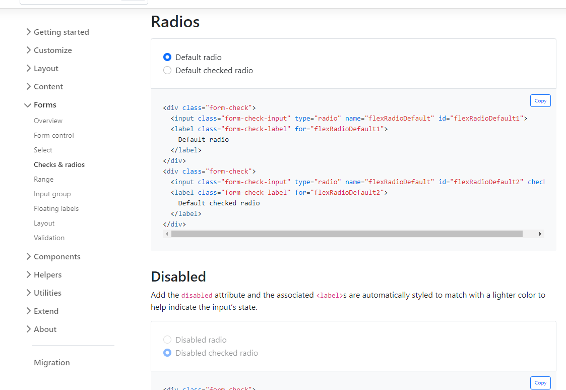
https://getbootstrap.com/docs/5.0/forms/checks-radios/
I’m not closed off I’m trying to see what could be better.
-
-
Block Domain
Solved Let's Build It -
-
-
-
hover link effect
Solved Customisation -
-