@crazycells said in CSS code customization for the link preview plugin:
does OGProxy show the pdf previews as well?
Not yet, but it could with a bit of additional code.
@phenomlab oh, I think I got it. that is a general property for all group badges?
I do not see any of them on mobile…
@crazycells yes, the badges by default do not display on less than 1200px I believe (I might be wrong)
hi @phenomlab , in this topic where the solution is chosen:
https://sudonix.org/topic/388/the-best-css-to-customize-our-logo
verified badge and online status are overlapping. I guess it is not intended?
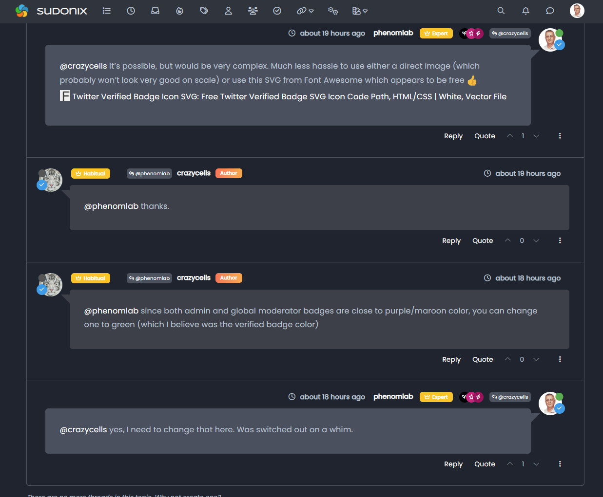
@crazycells hmm, I’m not seeing that. Can you provide a screenshot?
@phenomlab sure, here is how I see it:

@crazycells ah, yes, I know why. There’s a class I haven’t committed.
Thanks. I’ll sort that out tomorrow.
@phenomlab said in Custom badges:
@crazycells @DownPW something of a “fresher” approach. Have a look at the below
Using the messenger type view I created, it then becomes possible to place the “verified” group according to the style from the same view.
This does mean some new CSS
.self-post a[href*="/groups/verified"] .group-label {
    position: absolute !important;
    right: 51px;
    top: 44px;
}
.topic-response-post a[href*="/groups/verified"] .group-label {
    position: absolute !important;
    left: 20px;
    top: 44px;
}
.topic-response-post i[component="user/status"] {
    position: absolute;
    left: -1px;
}
And, more importantly, I found a more efficient way of adding classes in the messenger view
js. The revised code is below// Target those elements already loaded in the DOM $(document).ready(function() { $(window).on('action:ajaxify.end', function(data) { $('li[component="post"]').each(function(i, obj) { if (!$(this).hasClass('self-post') || (!$(this).hasClass('self-post'))) { console.log("Adding required classes for messenger type view"); $(this).addClass('topic-response-post'); } }); }); }); // Target elements dynamically added to the DOM on post load $(document).ready(function() { $(window).on('action:ajaxify.loaded', function(data) { $('li[component="post"]').each(function(i, obj) { if (!$(this).hasClass('self-post') || (!$(this).hasClass('self-post'))) { console.log("Adding required classes for messenger type view"); $(this).addClass('topic-response-post'); } }); }); });
My style looks like it with those codes. There isjust seems some blue color of my checked icon ")

 undefined cagatay referenced this topic on
@cagatay you should remove those two CSS blocks your referenced as that’s what’s causing the odd looking blue circles over the avatar.
@phenomlab which one i should remove?
@cagatay These
.self-post a[href*="/groups/verified"] .group-label {
    position: absolute !important;
    right: 51px;
    top: 44px;
}
.topic-response-post a[href*="/groups/verified"] .group-label {
    position: absolute !important;
    left: 20px;
    top: 44px;
}
.topic-response-post i[component="user/status"] {
    position: absolute;
    left: -1px;
}
@phenomlab its not work, nothing changed when i deleted those css.
@cagatay what isn’t working?
@phenomlab there is no changes after deleted css code;

@phenomlab how can i set blue tick like sudonix to my own? coz codes which you are shared, it not look like yours;
@cagatay It’s documented here
https://sudonix.com/topic/386/custom-badges/18?_=1669196219630
 undefined phenomlab referenced this topic on
@phenomlab i read it and did it what you wrote. but result as below;

blue icon not seen, it hide by avatar
@cagatay Yes, having checked, I see what you mean. I’ve fixed this on your site.
This is the new applied code
.post-header a[href*="/groups/onaylı-üyeler"] {
    margin-right: 3px;
    margin-top: 1px;
    border-radius: 50%;
    line-height: 20px;
    display: inline-block;
    vertical-align: middle;
    text-align: center;
    overflow: hidden;
}
small.label.group-label.inline-block i {
    margin-top: 1px;
    margin-left: 0px;
    vertical-align: middle;
    justify-content: center;
    display: flex;
}
.post-header a[href*="/groups/onaylı-üyeler"] .group-label {
    min-width: 20px;
    display: flex;
    justify-content: center;
}
.self-post a[href*="/groups/onaylı-üyeler"] .group-label {
    position: absolute !important;
    right: 51px;
    top: 44px;
    z-index: 2;
}
.topic-response-post a[href*="/groups/onaylı-üyeler"] .group-label {
    position: absolute !important;
    left: 20px;
    top: 44px;
    z-index: 2;
}
.topic-response-post i[component="user/status"] {
    position: absolute;
    left: -1px;
}
.group-label {
    vertical-align: -6px;
}
However, there were some errors on your part. You were correct in renaming the actual group in CSS (good call) because of the language not being English, but the path was incorrect. You used the below, which was customized for @crazycells install
/forum/groups/onaylı-üyeler
It should be
/groups/onaylı-üyeler
You also have some overriding CSS somewhere that defines a lower z-index value which forces the “verified” icon behind the avatar, so I’ve added an adjustment for that
z-index: 2;
@phenomlab ah okey Mark you as always better then me so there is no word in my side for the explaniton
thank you again.
@cagatay said in Custom badges:
@phenomlab ah okey Mark
thank you again.
hi @cagatay , as a first step you have to create a group called “verified” , then everything is as it is written on this thread… but since your group name was different, it gave an error…
I am writing this explicitly so that others can be aware.
@crazycells said in Custom badges:
I am writing this explicitly so that others can be aware.
Good point. Thanks