@crazycells said in CSS code customization for the link preview plugin:
does OGProxy show the pdf previews as well?
Not yet, but it could with a bit of additional code.
Hi,
I would like to ask how to style the tool tip in nodebb-plugin-user-level, that appears when you click on the user level icon. I just want to change some text styling. I’m trying to target it with the dev tools but can’t see any changes to the DOM.
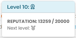
Btw it seems that on your site you removed the level in form of text, it looks nice and minimalistic but the tool tip information doesn’t make much sense to me.
edit: I think I got it, after the stars there come different medals right? I like the star system ")
@dave1904 said in How to style tool tip of nodebb-plugin-user-level:
I’m trying to target it with the dev tools but can’t see any changes to the DOM.
That’s a common issue in the sense that it will disappear from the DOM on lost focus, and this post will certainly help with that
https://sudonix.org/topic/483/targeting-a-disappearing-element-for-its-css
@dave1904 said in How to style tool tip of nodebb-plugin-user-level:
edit: I think I got it, after the stars there come different medals right? I like the star system
Exactly that. Thanks.
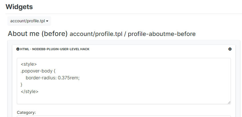
See here for icon :
Here my CSS for user level :
/*----------------------------------------------------------------------------*/
/*--------------           nodebb-plugin-user-level          -----------------*/
/*----------------------------------------------------------------------------*/

/* style */
.user-level-topic {
  vertical-align: middle;
  border-radius: 0.25rem !important;
  border: 2px solid var(--bs-user-level-border);
  margin-left: 8px;
  margin-right: 5px;
  margin-top: -2px;
  color: var(--bs-body-color-primary) !important;
  background: var(--bs-user-level-bg) !important;
  float: right;
  font-size: 12px;
  padding: 0px 10px !important;
  font-weight: 600;
  height: 23px !important;
}

/* Style on Profile page */
.level-index>div:first-child {
    padding: 6px 15px 3px 15px;
    border: 2px solid var(--bs-user-level-border);
    border-radius: var(--bs-border-radius);
    margin: 5px 28px 5px 0px;
    color: var(--bs-link-color);

}

.level-index > div:first-child:before {
    font-family: var(--bs-shoutbox-header-font-family) !important;
    content: var(--bs-shoutbox-header-icon) !important;
    margin-right: 8px;
}

/* icon, font */
.user-level-topic:before {
  /* content: "\f521";   */
  /* font-family: "Font Awesome 6 pro "; */
  content: var(--bs-user-level-icon);
  font-family: "Font Awesome 6 Pro";
  margin-right: 5px;
  font-weight: 600;
}

/* Popover Style */
.popover-body {
    background: var(--bs-body-bg) !important;
    color: var(--bs-body-color) !important;
    border: 1px solid var(--bs-border-color);
    border-radius: 0 0 0.375rem 0.375rem;
    margin: 0px;
}
.popover-header {
    border-top: 1px solid var(--bs-border-color);
    border-left: 1px solid var(--bs-border-color);
    border-right: 1px solid var(--bs-border-color);
    background-color: var(--bs-alert-info-bg);
    color: var(--bs-link-color);
    border-top-left-radius: 0.375rem;
    border-top-right-radius: 0.375rem;
    margin: 0px;
}
.bs-popover-auto[data-popper-placement^=top]>.popover-arrow::after, .bs-popover-top>.popover-arrow::after,{
    border-top-color: var(--bs-border-color);
}
.bs-popover-auto[data-popper-placement^=top]>.popover-arrow::after, .bs-popover-bottom>.popover-arrow::after,{
    border-bottom-color: var(--bs-border-color);
}
.bs-popover-auto[data-popper-placement^=left]>.popover-arrow::after, .bs-popover-end>.popover-arrow::after {
    border-left-color: var(--bs-border-color);
}
.bs-popover-auto[data-popper-placement^=right]>.popover-arrow::after, .bs-popover-end>.popover-arrow::after {
    border-right-color: var(--bs-border-color);
}
and hack for user level on Account profile :
@DownPW thanks. I forgot about that.
 undefined dave1904 has marked this topic as solved on