

Many thanks! I’ll use your walkthrough and go for the self-hosted solution.
nodebb-user-level customisation : popover element
Solved
Customisation
-
hello
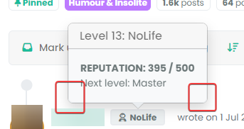
How can I target the following CSS elements ?
I have custom themes and I need to modify these elements because on dark theme, we have bug like here on Sudonix.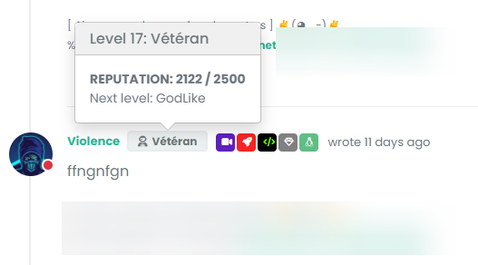
@barisusakli said It’s a standard bootstrap popover so you can use the .popover class to target it.
It has .popoover, .popover-header, .popover-body, popover-arrow classes but when I target these, I loose border and border-radius and arrow target seems to doesn’t workI need background boy, background title, border color, border-radius, arrow color, etc…
Thanks in advance
-
@DownPW This isn’t as simple as it looks, because
bootstrapis usinginsetborder radiusHere’s a workaround
.popover-body {
    background: var(--bs-body-bg) !important;
    color: var(--bs-body-color) !important;
    border: 1px solid var(--bs-border-color);
    border-radius: 0 0 0.375rem 0.375rem;
    margin: 0px;
}
.popover-header {
    background-color: var(--bs-alert-info-bg);
    color: var(--bs-alert-info-color);
    border-top-left-radius: 0.375rem;
    border-top-right-radius: 0.375rem;
    margin: 0px;
}
.bs-popover-auto[data-popper-placement^=top]>.popover-arrow::after, .bs-popover-top>.popover-arrow::after,{
    border-top-color: var(--bs-border-color);
}
.bs-popover-auto[data-popper-placement^=top]>.popover-arrow::after, .bs-popover-bottom>.popover-arrow::after,{
    border-bottom-color: var(--bs-border-color);
}
.bs-popover-auto[data-popper-placement^=left]>.popover-arrow::after, .bs-popover-end>.popover-arrow::after {
    border-left-color: var(--bs-border-color);
}
.bs-popover-auto[data-popper-placement^=right]>.popover-arrow::after, .bs-popover-end>.popover-arrow::after {
    border-right-color: var(--bs-border-color);
}
Then, in the
widgetssection -/admin/extend/widgetsselect theaccount/profile.tplwidget, and add the below HTML<style> .popover-body { border-radius: 0.375rem; } </style>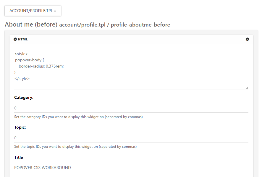
Save the widget.
This is the closest you can get unfortunately. It’s something of a hack, but a necessary evil.
-
Images are not seen
-
arf I can’t edit first post
-
@cagatay Initial post edited. Not sure why that is…

-
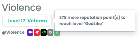
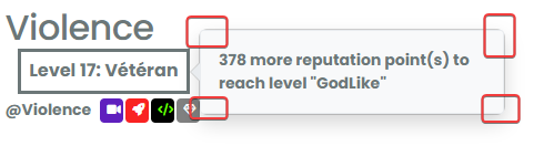
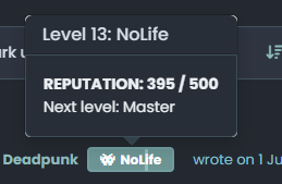
@DownPW You mean something like this ?
-
exactly my friend
")
same things for second screenshot
-
@DownPW This will work - obviously, modify to suit your needs
.popover { border-radius: 0.375rem; } .popover-body { background: var(--bs-body-navbar) !important; color: var(--bs-body-color) !important; border: 1px solid var(--bs-border-color); border-radius: 0 0 0.375rem 0.375rem; } .popover-header { background-color: var(--bs-alert-info-bg); color: var(--bs-alert-info-color); } .bs-popover-auto[data-popper-placement^=top]>.popover-arrow::after, .bs-popover-top>.popover-arrow::after { border-top-color: var(--bs-border-color); } -
@DownPW Try this
.bs-popover-auto[data-popper-placement^=right]>.popover-arrow::after, .bs-popover-end>.popover-arrow::after {
    border-right-color: var(--bs-border-color);
}
It’s important to remember that
JSwill determine the popup position and then add the arrow to suit. In this case, you’d need the below CSS to capture all of them.bs-popover-auto[data-popper-placement^=top]>.popover-arrow::after, .bs-popover-top>.popover-arrow::after,{ border-top-color: var(--bs-border-color); } .bs-popover-auto[data-popper-placement^=top]>.popover-arrow::after, .bs-popover-bottom>.popover-arrow::after,{ border-bottom-color: var(--bs-border-color); } .bs-popover-auto[data-popper-placement^=left]>.popover-arrow::after, .bs-popover-end>.popover-arrow::after { border-left-color: var(--bs-border-color); } .bs-popover-auto[data-popper-placement^=right]>.popover-arrow::after, .bs-popover-end>.popover-arrow::after { border-right-color: var(--bs-border-color); } -
 undefined phenomlab has marked this topic as solved on
-
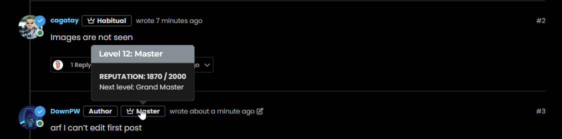
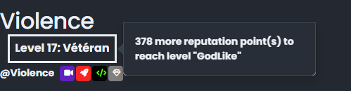
better result than me but did you see this ?
- The border radius is much larger than the original
- On light theme, seems border was blurry
- And in addition of blur, on dark/mid theme, we have 2 border with haven’t radius. Don’t know why
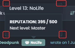
–> I have the same behavior with my code when I have tested
-
@DownPW Ooops…
Sorry - I forgot a class - original answer modified
.popover { border-radius: 0.375rem; } -
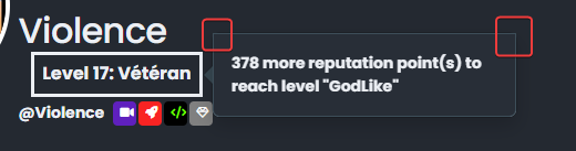
hmmm nope it doesn’t change anything
see it’s worse ^^
–> I have the same behavior with my code last night

EDIT:
I f you play with border-radius you better seen the bug
There missing something -
@DownPW This isn’t as simple as it looks, because
bootstrapis usinginsetborder radiusHere’s a workaround
.popover-body {
    background: var(--bs-body-bg) !important;
    color: var(--bs-body-color) !important;
    border: 1px solid var(--bs-border-color);
    border-radius: 0 0 0.375rem 0.375rem;
    margin: 0px;
}
.popover-header {
    background-color: var(--bs-alert-info-bg);
    color: var(--bs-alert-info-color);
    border-top-left-radius: 0.375rem;
    border-top-right-radius: 0.375rem;
    margin: 0px;
}
.bs-popover-auto[data-popper-placement^=top]>.popover-arrow::after, .bs-popover-top>.popover-arrow::after,{
    border-top-color: var(--bs-border-color);
}
.bs-popover-auto[data-popper-placement^=top]>.popover-arrow::after, .bs-popover-bottom>.popover-arrow::after,{
    border-bottom-color: var(--bs-border-color);
}
.bs-popover-auto[data-popper-placement^=left]>.popover-arrow::after, .bs-popover-end>.popover-arrow::after {
    border-left-color: var(--bs-border-color);
}
.bs-popover-auto[data-popper-placement^=right]>.popover-arrow::after, .bs-popover-end>.popover-arrow::after {
    border-right-color: var(--bs-border-color);
}
Then, in the
widgetssection -/admin/extend/widgetsselect theaccount/profile.tplwidget, and add the below HTML<style> .popover-body { border-radius: 0.375rem; } </style>Save the widget.
This is the closest you can get unfortunately. It’s something of a hack, but a necessary evil.
-
undefined phenomlab has marked this topic as solved on
-
@phenomlab said in nodebb-user-level customisation : popover element:
@DownPW This isn’t as simple as it looks, because bootstrap is using inset border radius
yes, that’s what I noticed !!

Thank you baris ^^Hence the need to open this topic
This hack seems to work, thanks again. If there is anything I will come back
-
@DownPW said in nodebb-user-level customisation : popover element:
Thank you baris ^^
Not his fault really - it’s the
BSlibrary behaviour by default. -
No no, I said that in the sense that he told me it was simple ^^
I was able to see that this was not the case by targeting the elements he had advised me. -
undefined phenomlab referenced this topic on
Did this solution help you?
-
Embedding external URLs
Solved General -
NodeBB v3 Vote Icon
Solved Customisation -
-
Quote design CSS
Solved Customisation -
-
-
-
NodeBB Design help
Solved Customisation