Skip to content

CSS code customization for the link preview plugin

Solved Customisation
  • Hi @phenomlab ,

    I am working on CSS codes to customize the link-preview plugin for some time, but I was unsuccessful 😄 so, I wanted to consult you in case I am missing an important line…

    Unfortunately, normal previews of this plugin are too big for our taste, just like how iframely used to be…

    https://sudonix.org/post/4083

    I ended up something like this:

    .post-container .content .card {
        display: contents !important;  
    }
    
    .link-preview {
        
        .card-img-top {
            height:120px !important;
            width: auto !important;
            overflow: hidden !important;        
            float: left !important;
            padding: 0 5px 0 0 !important;      
        }
        
        .card-body {
            padding: 1px 1px 1px 1px !important;
        }
        
        .card-footer {
            position: relative !important;    
        }
    }
    

    But this is nowhere near close to what I was aiming…

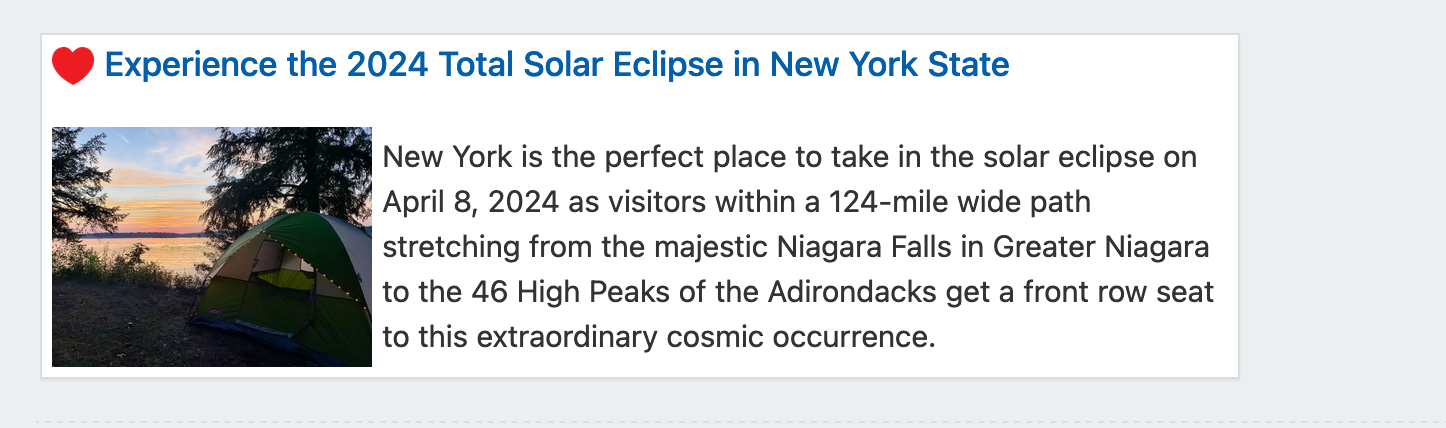
    This is how it used to be with iframely and what we are aiming:
    Screenshot 2024-04-02 at 22.04.41.png

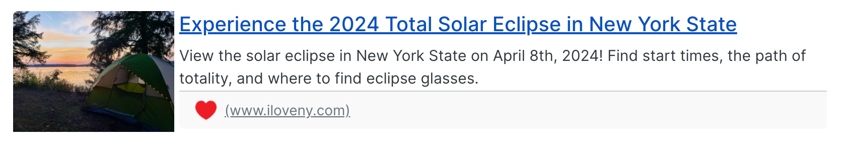
    This is how ugly it looks right now 😄

    Screenshot 2024-04-02 at 22.02.51.png

    I hope you can help with this transformation 😄
    Thanks,

  • @crazycells technically possible, yes - I can get somewhere near the desired layout as below

    7b646096-5c21-44a1-b283-54d6f94e579b-image.png

    However, this isn’t great from the CSS perspective as it’s something of a hack, and will not look good on mobile devices. Here’s the CSS for that if you want to use it.

    .post-container .content .card {
        display: contents !important;  
    }
    .link-preview .card-title {
        margin-left: -238px;
        float: left;
    }
    .link-preview .card-img-top {
        height: 120px !important;
        width: auto !important;
        overflow: hidden !important;
        float: left !important;
        padding: 0 5px 0 0 !important;
        margin-top: 35px;
    }
    .link-preview .card-text {
        margin-top: 20px;
        padding-left: 15px;
    }
    .link-preview .card-footer {
        position: relative !important;
        margin-top: 70px;
    }
    .link-preview .card-body {
        padding: 1px 1px 1px 1px !important;
    }
    .link-preview .card-text {
        margin-top: 35px;
        padding-left: 15px;
    }


    The real issue with nodebb-plugin-link-preview is that it has no flexibility in terms of HTML layout meaning you have to get clever with CSS (and even then, it’s not clever at all).

    Using my OGProxy function, it would look like this by default

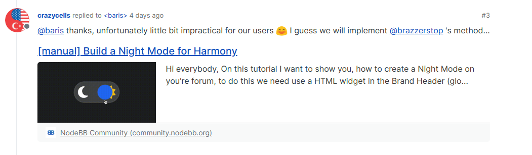
    https://community.nodebb.org/topic/17109/manual-build-a-night-mode-for-harmony

    However, because you have control over the HTML, you can simply rearrange it to suit your own needs.

  • phenomlabundefined phenomlab has marked this topic as solved on
  • @phenomlab does OGProxy show the pdf previews as well?

  • @crazycells said in CSS code customization for the link preview plugin:

    does OGProxy show the pdf previews as well?

    Not yet, but it could with a bit of additional code.


Did this solution help you?
Did you find the suggested solution useful? Why not buy me a coffee? It's a nice gesture, and a great way to show your appreciation 💗

  • Composer Zen icon?

    Solved Configure
    8
    2 Votes
    8 Posts
    216 Views

    @DownPW exactly. Not really a new concept, and in all honesty, not something I’ve ever used.

    If you consider the need to add links and references, or citations, you’d need to be able to see other parts of the screen!

  • NodeBB: Consent page

    Solved Configure
    16
    4 Votes
    16 Posts
    559 Views

    @DownPW I still do not see any issues.

  • Gettin Erors NodeBB

    Solved Configure
    7
    0 Votes
    7 Posts
    327 Views

    @phenomlab no forum is working goods.
    there is no eror message since yestarday.

  • hover link effect

    Solved Customisation
    18
    6 Votes
    18 Posts
    614 Views

    @DownPW Looking at the underlying code, class start is being added on hover by jQuery in this function

    document.querySelectorAll(".button-gradient, .button-transparent").forEach((button) => { const style = getComputedStyle(button); const lines = document.createElement("div"); lines.classList.add("lines"); const groupTop = document.createElement("div"); const groupBottom = document.createElement("div"); const svg = createSVG( button.offsetWidth, button.offsetHeight, parseInt(style.borderRadius, 10) ); groupTop.appendChild(svg); groupTop.appendChild(svg.cloneNode(true)); groupTop.appendChild(svg.cloneNode(true)); groupTop.appendChild(svg.cloneNode(true)); groupBottom.appendChild(svg.cloneNode(true)); groupBottom.appendChild(svg.cloneNode(true)); groupBottom.appendChild(svg.cloneNode(true)); groupBottom.appendChild(svg.cloneNode(true)); lines.appendChild(groupTop); lines.appendChild(groupBottom); button.appendChild(lines); button.addEventListener("pointerenter", () => { button.classList.add("start"); }); svg.addEventListener("animationend", () => { button.classList.remove("start"); }); }); })

    The CSS for start is below

    .button-gradient.start .lines svg, .button-transparent.start .lines svg { animation: stroke 0.3s linear; }

    And this is the corresponding keyframe

    @keyframes stroke { 30%, 55% { opacity: 1; } 100% { stroke-dashoffset: 5; opacity: 0; } }

    It’s using both CSS and SVG, so might not be a simple affair to replicate without the SVG files.

  • 0 Votes
    15 Posts
    689 Views

    @DownPW That was going to be my next suggestion 🙂

  • Avatar on Topic Header

    Solved Customisation
    9
    0 Votes
    9 Posts
    527 Views

    @jac said in Avatar on Topic Header:

    @downpw said in Avatar on Topic Header:

    Great Plugin 🙂

    I make it a bit cleaner via this CSS code:

    /*------------------------------------------------------------------*/ /*---------------- nodebb-plugin-browsing-users -----------------*/ /*------------------------------------------------------------------*/ /*Space between the avatar and the RSS icon */ .topic [component="topic/browsing-users"] { margin-bottom: -5px; padding-left: 10px; } /*Space between avatars*/ .pull-left { float: left!important; padding-right: 5px; }

    Do you have a screenshot of how this looks with the CSS change?

    Just added this change, thanks @DownPW 🙂

  • 2 Votes
    7 Posts
    413 Views

    yeah you’re right @phenomlab.
    Problem of NodeBB Version

  • Bug Navbar CSS

    Solved Customisation
    3
    1 Votes
    3 Posts
    302 Views

    Not better way.

    Thanks.