
@Panda because there is no match for the DNS entry specified. The receiving web server parses the headers looking for a destination hostname to match, and anything the web server is unable to resolve will be sent back to the root.
Bug Report
Solved
Bugs
-
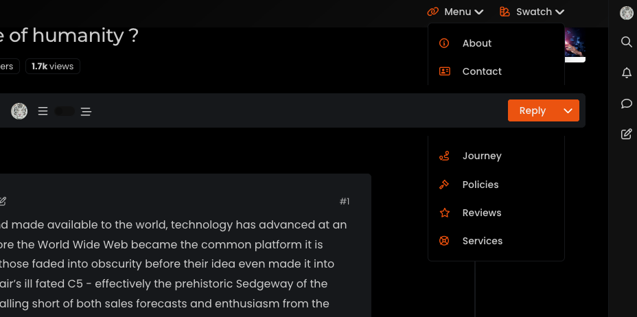
Hi @phenomlab , sticky topic toolbar is preventing “menu” and “swatch” panels… FYI…
-
Ok, I think finally fixed this by altering some of the
heightattributes of child elements, and setting the top navbar asz-index: 500 -
@crazycells ugh. Thanks. I thought I had fixed that. So you get the same issue if you reload the site and choose a different swatch?
Edit - wait. That looks like missing CSS from the threaded function. I’ll need to check that.
-
@crazycells This should be fixed now.
EDIT: Actually, not fixed. This issue is in fact caused by a bug in Boostrap itself
It was reported in 2020, but still an issue in 2023 surprisingly
https://github.com/twbs/bootstrap/issues/31747
Based on this, I have some choices to make - bear with me.
-
 undefined phenomlab marked this topic as a question on
-
undefined phenomlab has marked this topic as solved on
-
@phenomlab Mark as you know i m using your CSS and JS codes also
") pls let me know changes on it?
pls let me know changes on it? -
@cagatay You aren’t using the most current CSS so this won’t affect you.
-
undefined phenomlab has marked this topic as unsolved on
-
Ok, I think finally fixed this by altering some of the
heightattributes of child elements, and setting the top navbar asz-index: 500 -
undefined phenomlab has marked this topic as solved on
-
@phenomlab yes , it is fixed now

-
undefined phenomlab forked this topic on
-
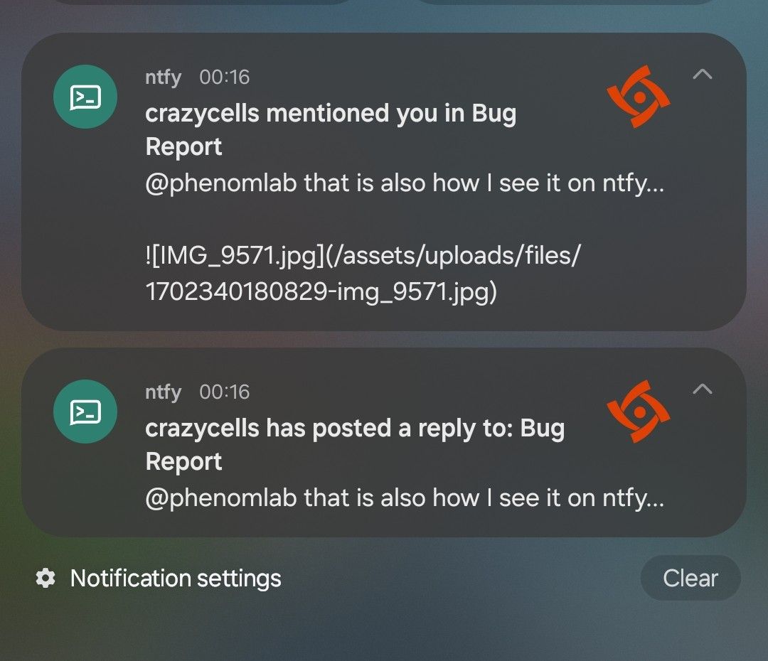
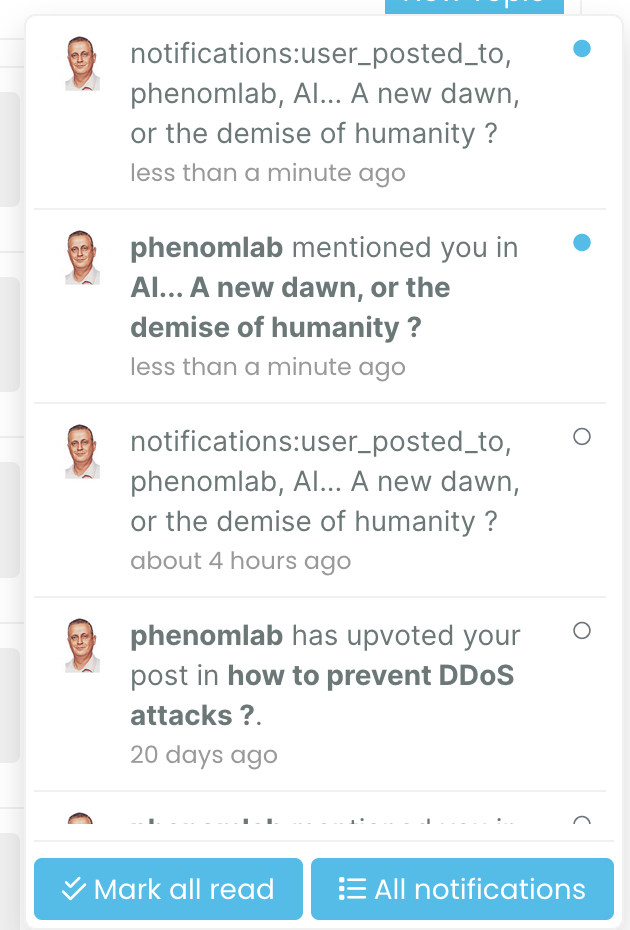
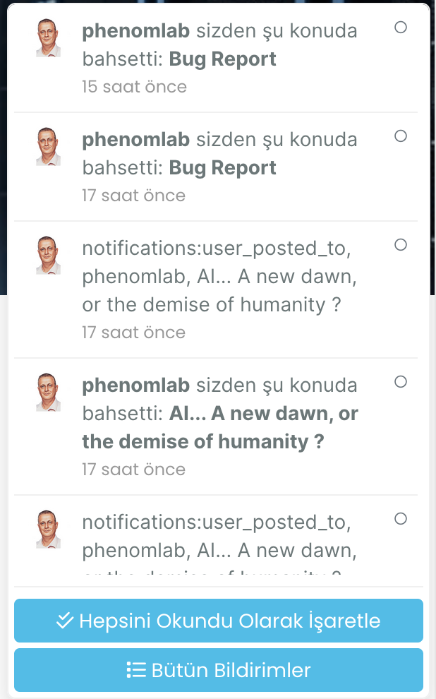
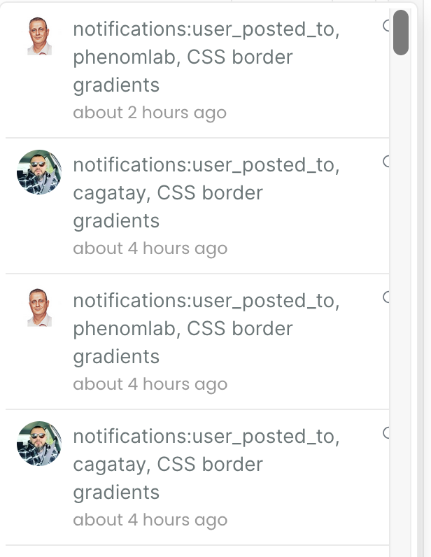
I think there is a problem related to notifications:
-
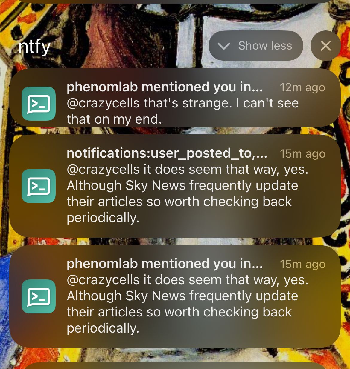
@crazycells that’s strange. I can’t see that on my end.
-
@phenomlab that is also how I see it on ntfy…
-
-
@phenomlab I see similar problem with Turkish translation as well… I am reporting this to @barisusakli
-
hi @phenomlab , I found this:
https://github.com/NodeBB/NodeBB/commit/844cb91beb3f2335e724770b29553081454b1297
so, recently
_is changed to-in notifications. are you using the last version of nodebb? -
@crazycells yes, as far as I know
-
@phenomlab I guess this will be fixed in 3.6… so, we should wait…
-
@crazycells yes, I think so. There are a number of other features in that release too such as extended social sharing.
-
hi @phenomlab , this notification problem continues for me… I believe those “user_posted_to” should be changed to “user-posted-to” in the codes…
-
do you use “nodebb-plugin-category-notifications” plugin?
-
Additionally, it looks like I am not watching this topic, but I get notification… strange… Does category-notification plugin cause this?
-
@crazycells said in Bug Report:
do you use “nodebb-plugin-category-notifications” plugin?
Yes, but am going to remove it. I think that’s the case because it’s out of date.
Did this solution help you?
-
-
-
-
-
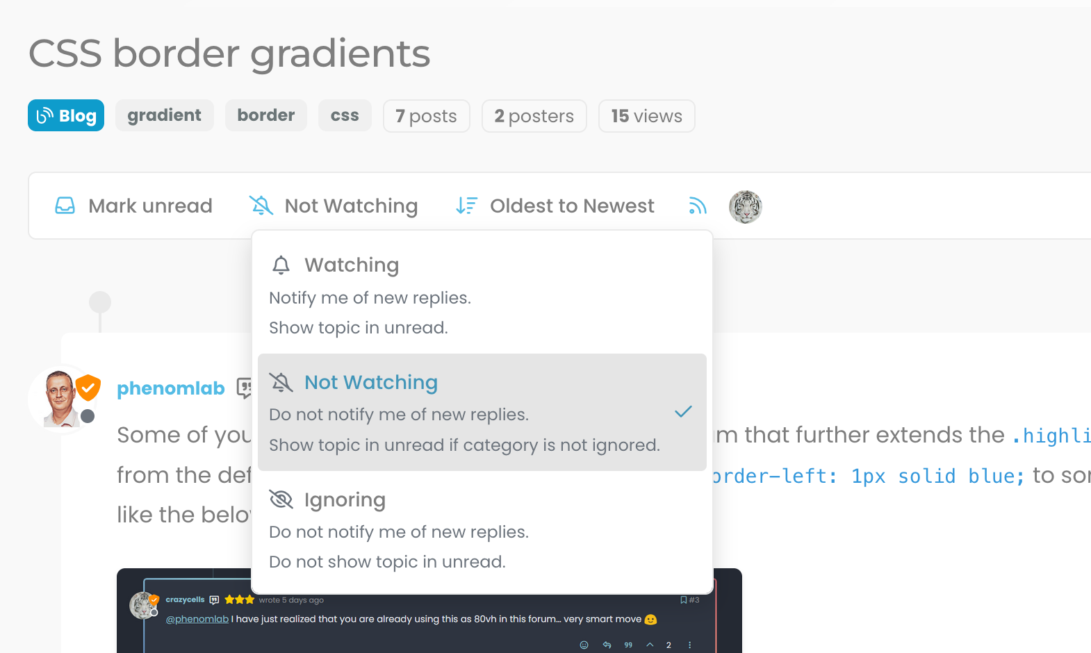
Post Style View
Solved Customisation -
-
-