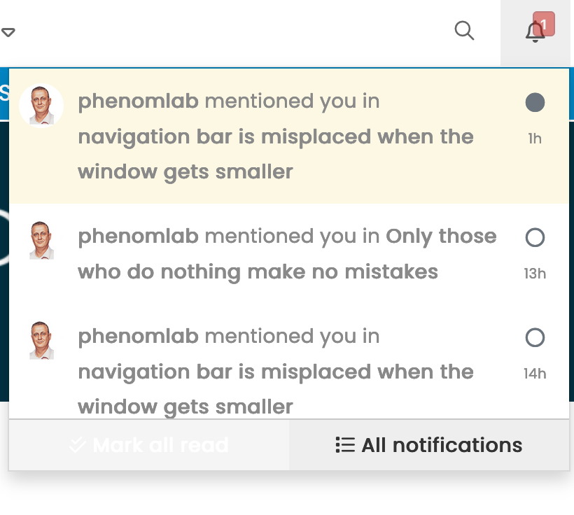
@crazycells this should be resolved now. I’ve had to adjust the breakpoints in Bootstrap (version 3 which NodeBB uses) to accommodate this, and it’ll fire at anything below 1199px (1000 just looks odd…)
Here’s the modified CSS in case you want it
@media (max-width: 1199px) {
  .navbar-header {
      float: none;
  }
  .navbar-left,.navbar-right {
      float: none !important;
  }
  .navbar-toggle {
      display: block;
  }
  .navbar-collapse {
      border-top: 1px solid transparent;
      box-shadow: inset 0 1px 0 rgba(255,255,255,0.1);
  }
  .navbar-fixed-top {
      top: 0;
      border-width: 0 0 1px;
  }
  .navbar-collapse.collapse {
      display: none!important;
  }
  .navbar-nav {
      float: none!important;
      margin-top: 7.5px;
  }
  .navbar-nav>li {
      float: none;
  }
  .navbar-nav>li>a {
      padding-top: 10px;
      padding-bottom: 10px;
  }
  .collapse.in{
      display:block !important;
  }
  div#nav-dropdown {
    display: none;
}
 .visible-xs-block, .visible-xs-inline, .visible-xs-inline-block {
    display: initial !important;
}
.container-fluid>.navbar-collapse, .container-fluid>.navbar-header, .container>.navbar-collapse, .container>.navbar-header {
    margin-right: -15px !important;
    margin-left: -15px !important;
}
.account .cover {
    background-size: auto;
    background-color: var(--breadcrumb);
    height: 150px;
}
.account .cover .avatar-wrapper {
    top: 80px;
    margin-top: 39px !important;
}
}
Note that there may be other elements that will require adjustment.
Try it out and let me know, but I think this resolves the problem.
NOTE: I’m using var in CSS, so you may want to either remove this line, or replace it with something else
background-color: var(--breadcrumb);


")
