@crazycells said in CSS code customization for the link preview plugin:
does OGProxy show the pdf previews as well?
Not yet, but it could with a bit of additional code.
@Teemberland yes. That’s correct. The path itself exists on the server, doesn’t it ? For example, there should be a directory under nodebb\public\customcss\file.css
@phenomlab ah, that’s my first mistake. I placed the css file on the theme level, like:
nodebb\node_modules\nodebb-theme-name\public\customcss\file.css
I moved the css file to nodebb\public like you mentioned, the error is gone after that.
when I click the switcher, however, the page flashes as if it’s trying to change the skin, but it goes back to the default theme right away. No errors in console.
@Teemberland can you provide the full JS code your are using, plus PM me your site details so I can have a look. I’ll also need an NodeBB account with admin rights.
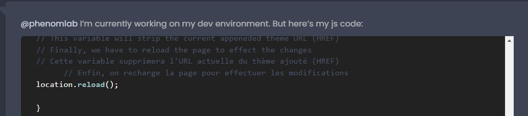
@phenomlab I’m currently working on my dev environment. But here’s my js code:
// ------------------------------------------
// Theme Switcher
// ------------------------------------------
//We generate a random character string to assign a version number to the CSS file.
// On génère une chaine de caractère aléatoire pour affecter un numéro de version au fichier CSS.
function generateRandomString(length) {

  var text = "";
  var possible = "ABCDEFGHIJKLMNOPQRSTUVWXYZabcdefghijklmnopqrstuvwxyz0123456789";

  for (var i = 0; i < length; i++) {
      text += possible.charAt(Math.floor(Math.random() * possible.length));
  }

  return text;
}

$(document).ready(function ()
{
var string = generateRandomString(10);
$("#random_string").text(string);
// This variable gets the theme ID
// Cette variable obtient l'ID du thème
var whichTheme = localStorage.getItem("theme");
// This variable gets the active theme's actual URL
//Cette variable obtient l'URL réelle du thème actif
var activeTheme = localStorage.getItem("activeTheme");
// This variable appends the dropdown list to the existing panel
// Cette variable ajoute la liste déroulante au panneau existant
var panel = $('<li id="switcher" class="dropdown text-center"> \
<label for="theme-control-list-check" class="dropdown-toggle" data-toggle="dropdown" id="theme_dropdown" title="" role="button" data-original-title="Theme" aria-expanded="false"> \
<a class="btn-link" title="Theme Switcher" href="#"><i id="ticon" class="fa fa-fw fa-lightbulb-o"></i><span class="visible-xs-inline">Theme Switcher</span></a> \
</label> \
<ul id="theme" class="dropdown-menu"> \
<li><a id="default" href="#" rel="/assets/client.css?v=e02phpkima0">Default</a></li> \
<li><a id="dark" href="#" rel="/assets/customcss/dark_skin.css">Dark</a></li> \
</ul> \
</div>');

// See if there is an active theme selected in localStorage. If none selected, use the default. If there is a theme in localStorage, use that and apply it
// Regarde s'il y a un thème actif sélectionné dans "localStorage". Si aucun n'est sélectionné, utilise la valeur par défaut.
// S'il y a un thème dans localStorage, on l'utilise et on l'applique.
if (whichTheme)
{
$("head").append("<link href='" + activeTheme + '?version=' + string + "' type=\"text/css\" rel=\'stylesheet\' />");
}
else
{
// No need to include anything here as there's no CSS to add.
// Pas besoin d'inclure quoi que ce soit ici car il n'y a pas de CSS à ajouter.
}

$('ul#logged-in-menu').prepend(panel);
$('ul#logged-out-menu').prepend(panel);

if (utils.findBootstrapEnvironment() === 'xs')
{
$('#menu').prepend(panel);
}

$(document).ready(function () {
// Listen to the NAV dropdown for any changes
// Écoute la liste déroulante NAV pour tout changement de thème
$("#theme li a").on("click change", function ()
{
// If we detect a change, append the selected CSS file into the DOM
// Si un changement est détecté, on ajoute le fichier CSS sélectionné dans le DOM (Document Object Model)
var thishref = $(this).attr('rel');
 $("link[rel=stylesheet]").attr('href' , thishref + "?version=" + string + "");
 //location.reload();
//$("head").append("<link href='" + $(this).attr("rel") + $(this).attr("id") + " type=\'text/css\' rel=\'stylesheet\' />");
location.reload();
// This variable stores the selected theme ID
// Cette variable stocke l'ID du thème sélectionné
var selected = $(this).attr("id");
// This variable stores the selected theme link
// Cette variable stocke le lien du thème sélectionné
var theTheme = $(this).attr("rel");
// This variable updates the selected theme ID
// See if "default" has been selected. If it has, then...
// Cette variable met à jour l'ID du thème sélectionné
  // Regarde si "default" a été sélectionné. Si c'est le cas, alors...
if (selected === 'default')
{
localStorage.setItem("theme", "");
// This variable will strip the current appeneded theme ID
// Cette variable supprimera l'ID du thème actuellement ajouté
localStorage.setItem("activeTheme", "");
// This variable will strip the current appeneded theme URL (HREF)
// Finally, we have to reload the page to effect the changes
// Cette variable supprimera l'URL actuelle du thème ajouté (HREF)
      // Enfin, on recharge la page pour effectuer les modifications
location.reload();

}
// If any other theme is selected, carry on as normnal, and update localStorage
// Si un autre thème est sélectionné, continuez normalement et mettez à jour localStorage
else
{
localStorage.setItem("theme", selected);
// This variable updates the actual href of the CSS file
// Cette variable met à jour le href réel du fichier CSS
localStorage.setItem("activeTheme", theTheme);
//window.location.href = window.location.href
}

// We use return false to prevent the browser from reloading or following any HREF links
// On utilise la fonction "return false" pour empêcher le navigateur de recharger ou de suivre les liens HREF
//return false;
});
});
});

// When hovering over the #switcher element, target the i class and add 'themeoff'
// Lorsque du  survol de l'élément #switcher, on cible la classe CSS "i" et on ajoute le CSS "themeoff"
$(document).on('mouseenter','#switcher', function() {
$('#switcher i').addClass("themeoff");
});
// When leaving the however state, target the i class and remove 'themeoff'
// Lorsque l'on quitte l'état, on cible la classe CSS "i" et on supprime le CSS "themeoff"
$(document).on('mouseleave','#switcher', function() {
$('#switcher i').removeClass("themeoff");
});
@Teemberland that looks generally ok, and it’s proven CSS. Can you please try to comment out the location.reload(); function here
Check the console for output, and let me know if you see any difference.
@phenomlab thank you for your reply. I commented that line, but the results are the same. It appears that it tries to change the skin on click, but it quickly reverts to the original skin. No console errors either.
@Teemberland Odd. Is there any way I can see this in process? Failing that, try the below code, which is the latest version
$(document).ready(function() {
	function generateRandomString(length) {

		var text = "";
		var possible = "ABCDEFGHIJKLMNOPQRSTUVWXYZabcdefghijklmnopqrstuvwxyz0123456789";

		for (var i = 0; i < length; i++) {
			text += possible.charAt(Math.floor(Math.random() * possible.length));
		}

		return text;
	}
	var string = generateRandomString(10);
	$("#random_string").text(string);
	var whichTheme = localStorage.getItem("theme");
	var activeTheme = localStorage.getItem("activeTheme");
	// If no theme is detected (for example, a new visitor), then set this to default
	if (!whichTheme) {
		// dark-mode media query matched or not
		let matched = window.matchMedia('(prefers-color-scheme: dark)').matches;
		//var override = getUrlParameter('override');

		if (matched) {
			// Offer the mifnight theme by default
			whichTheme = "midnight";
			activeTheme = "/assets/customcss/midnight.css?version=" + string;
			//$("link[rel=stylesheet]").attr('href' , thishref + "?version=" + string + "");
		} else {
			// Leave the default theme intact
			whichTheme = "default";
			activeTheme = "/assets/customcss/daylight.css?version=" + string;
		}
		// See if override has been enabled
		if (whichTheme === 'default') {
			// Sudonix is overriding operating system settings and will force dark scheme
			activeTheme = "/assets/customcss/daylight.css?version=" + string;
		}
		if (whichTheme === 'daylight') {
			// $('[component="post"]').addClass("background");
			$('li.self-post .content:not(.isSolved [component="post/content"]').addClass("response");
		} else {
			// Nothing to do :)
		}
	}

	/*$(".forum-logo").attr("src","/assets/uploads/system/sl_" + whichTheme + ".webp?version=" + string + ""); */
	var panel = $('<li id="switcher" class="dropdown"> \
<a title="" data-original-title="Swatch" class="navigation-link dropdown-toggle" href="#" role="button" data-toggle="dropdown" aria-haspopup="true" aria-expanded="false"> \
<i id="ticon" class="fa fa-light fa-swatchbook" data-content="" aria-hidden="true"></i> \
<span class="visible-xs-inline">Swatch</span> \
<i class="fa fa-caret-down" aria-hidden="true"></i> \
</a> \
<ul id="theme" class="dropdown-menu"> \
<li><a id="default" href="#" rel="/assets/customcss/yourtheme.css">Your Theme</a></li> \
</ul> \
</li> \
</div> \
');


	if (whichTheme) {
		$.get(activeTheme, function(css) {
			$('<style type="text/css"></style>')
				.html(css)
				.appendTo("head");
		});
	} else {}

	$('#main-nav').append(panel);

	if (utils.findBootstrapEnvironment() === 'xs') {
		$('#main-nav').append(panel);
	}

	$(document).ready(function() {

		$("body").on("click change", "#theme li a", function() {
			var thishref = $(this).attr('rel') + '?version=' + string;
			$.get(thishref, function(css) {
				$('<style type="text/css"></style>')
					.html(css)
					.appendTo("head");
			});
			console.log("Applying swatch " + thishref);
			//location.reload();
			var selected = $(this).attr("id");
			var theTheme = $(this).attr("rel");
			if (selected === 'default') {
				localStorage.setItem("theme", selected);
				localStorage.setItem("activeTheme", "/assets/customcss/daylight.css?version=" + string);
				//location.reload();
			} else {
				localStorage.setItem("theme", selected);
				localStorage.setItem("activeTheme", theTheme);
			}
			return false;
		});
	});
});
Note that there are assumptions here in that default is actually daylight.css on Sudonix if you are using light mode, and midnight if you are using dark mode - these are taken from the browser settings, and the operating system if supported.
@phenomlab okay, now I can see the style tag being appended on click. Now I’m thinking I have an error in my css file.
Looking at one of your css files here, it looks something like this:
@import "/assets/customcss/editors/stackoverflow-dark.css";
:root {
    --first: #2b3e50;
    --second: #4e5d6c;
    ....
How is that being generated?
@Teemberland It’s not “generated” - it’s created manually in the CSS files I put together. Essentially, each time you change the swatch, the CSS isn’t being loaded all over again (for clarity, all CSS MUST be placed in admin/appearance/customise#custom-css) - instead, it’s just changing the variables you have assigned.
For example
:root {
--background: #ffffff;
--body: #cccccc;
..... etc
}
In the CSS you add to admin/appearance/customise#custom-css, you’d use these variables like the below
body {
background: var(--body);
}
..... etc
This way, the CSS is only being executed once at page load, and then the swatch vars are the only thing changed when you switch themes or swatches.
@phenomlab gotcha! I’ll work on this and report back later. Thank you!
@phenomlab I can see my custom css being appended to head, but it’s odd that the variable in my custom css is not loading on the page.
I’m keeping it simple and just trying to change the background-color of my forum by setting the following code in ACP > Appearance > Custom Content > Custom CSS
body { background-color: var(--body); }
But when I inspect the page, I can see my root styles being loaded, but the code above is no where to be found. Unlike in your forums, when you inspect the page, you can see the styles for body with this rule:
body { var(--first) !important }
@Teemberland can you share the css you are using ?
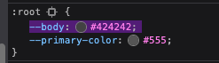
@phenomlab here’s what I have in my default.css which is located in /assets/customcss/default.css
:root {
  --body: #fff;
  --primary-color: #000;
}
here’s what I in dark_skin.css
:root {
  --body: #424242;
}
here’s what I have in ACP > CUSTOM CSS
body {
  background-color: var(--body);
}

/*----------------------------------------------------------------------------*/
/*----------------------        Themes Switcher        -----------------------*/
/*----------------------------------------------------------------------------*/

/* Works with CUSTOM JS */
/* DON'T DELETE - DON'T MOVE */
/* -- */
/* Fonctionne avec du CUSTOM JS */
/* NE PAS SUPPRIMER - NE PAS  DEPLACER */

/*Desktop*/
/*Allows to have the "Theme Switcher" icon in black after a mouse click and during the dropdown */
/*Permet d'avoir l'icone du "Theme Switcher" en noir après un clic souris et lors du dropdown */
[aria-expanded="true"] a #ticon {
  color: #000000;
}

/*Theme Switcher icon color via CUSTOM JAVASCRIPT */
/* Blank without mouse over */
/*Couleur de l'icone du Theme Switcher via le CUSTOM JAVASCRIPT */
/* Blanc sans mouse over*/
.themeon {
  color: #ffffff !important;
}

/*Black with mouseover*/
/*Noir avec mouse over*/
.themeoff {
  color: #000000 !important;
}

/*Smartphone*/
@media all and (max-width: 1024px) {

  /*BUGFIX: Placement of the "Theme Switcher" */
  /*BUGFIX: Placement du "Theme Switcher" */
  #switcher {
    list-style: none;
    margin-left: -80px;
    padding-top: 15px;
  }

  /*BUGFIX: Space between the icon and the text "Theme Switcher" */
  /*BUGFIX: Espace entre l'icone et le texte "Theme Switcher" */
  #switcher .fa-fw {
    text-align: center;
    width: 1.25em;
    padding-right: 25px;
  }

  /* DON'T DELETE - DON'T MOVE */
  /*Allows to have the "Theme Switcher" icon in white after a mouse click and during the dropdown */
  /* NE PAS SUPPRIMER - NE PAS  DEPLACER */
  /*Permet d'avoir l'icone du "Theme Switcher" en blanc après un clic souris et lors du dropdown */
  [aria-expanded="true"] a #ticon {
    color: #ffffff;
  }

  /*Theme Switcher icon color via CUSTOM JAVASCRIPT */
  /* Blank without mouse over */
  /*Couleur de l'icone du Theme Switcher via le CUSTOM JAVASCRIPT */
  /* Blanc sans mouse over*/
  .themeoff {
    color: #ffffff !important;
  }
}

/*FIREFOX BUGFIX: Remove dotted border from icon when clicked */
/*BUGFIX FIREFOX: Suppression de la bordure pointillée de l'icône quand on clique dessus */
/*Desktop*/
a:focus {
  outline: 0;
}

/*Smartphone*/
@media all and (max-width: 1024px) {
  a:focus {
    outline: 0;
  }
}


/* Desktop */
/*Button Position */
/*Position du Bouton */
.header #theme_dropdown {
  /*padding: 9px 15px;*/
  padding: 9px 15px;
  padding-top: 9px;
  padding-bottom: 9px;
  margin-top: -4px;
  padding-top: 15px;
  padding-bottom: 14px;
}

/* ---- Appearance of the "Theme Switcher" icon in the navbar via Font Awesome (!!Change the CSS class also in the JS!!) ----*/
/*Ampule*/
/* ---- Apparence de l'icône du "Theme Switcher" dans la navbar via Font Awesome (!!Changer la class CSS aussi dans le JS!!) ----*/
/*Ampoule*/
.fa.fa-lightbulb-o:before {
  content: "\f0eb";
}

/*Navbar height to play with background height */
/*Hauteur navbar pour jouer avec la hauteur du background */
.navbar-default {
  height: 51px;
}

/*Spacing between "Search" and "Notifications" icons */
/*Espacement entre les icônes "Recherche" et "Notifications" */
#switcher {
  margin-top: 4px;
}

/*We remove the background on the icon */
/*On supprime le background sur l'icone */
#switcher .btn-link:hover {
  background: none !important;
}

/*Background color on mouseover (Default Theme) */
/*Couleur du background au survol souris (Default Theme) */
.navbar-default .navbar-nav>li>label:hover {
  background: #eeeeee;
}

/*Appearance of selection menu */
/*Apparence du menu de sélection */
#theme.dropdown-menu {
  position: absolute;
  top: 44px;
  right: 0px;
  z-index: 1000;
  float: left;
  min-width: 160px;
  padding: 5px 0;
  margin: 2px 0 0;
  list-style: none;
  font-size: 14px;
  text-align: left;
  background-clip: padding-box;
}

/* Smartphone */
/*Appearance of button and drop-down menu on Smartphone */
/*Apparence du bouton et du menu déroulant sur Smartphone */
@media all and (max-width: 1024px) {

  /*Dropdown menu text color */
  /*Couleur du texte du menu déroulant */
  #theme.dropdown-menu>li>a {
    display: block;
    padding: 3px 20px;
    clear: both;
    font-weight: 400;
    line-height: 1.42857143;
    color: #fff;
    white-space: nowrap;
    background: #3A3C41;
  }

  /*Appearance and position of button and drop-down menu */
  /*Apparence et position du bouton et du menu déroulant */
  #theme.dropdown-menu {
    position: fixed;
    top: 140px;
    left: 15px;
    z-index: 1000;
    float: left;
    min-width: 185px;
    padding: 5px 0;
    margin: 2px 0 0;
    list-style: none;
    font-size: 14px;
    text-align: left;
    /* background-clip: padding-box; */
    color: #fff;
    background: #3A3C41;
    width: 60px;
    /* VIOLENCE: Largeur */
    border: 1px solid black;
  }


  /*Text color and button background when selected */
  /*Couleur du texte et background du bouton lors de la selection */
  .btn-link:focus,
  .btn-link:hover {
    /*color: #23527c;*/
    color: lightgrey;
    text-decoration: underline;
    background-color: transparent;
  }

  /*We remove the white bars at the top and bottom of the button on Smartphone */
  /*On supprime les barres blanches en haut et en bas du bouton sur Smartphone */
  .navbar-form {
    left: 20px;
    box-shadow: none;
    list-style: none;
  }
}
I put body on top of custom css for visibility.
NOTE: When I create a new styles for body in the inspector using the variable, it works fine. I think once my styles in ACP > CUSTOM CSS shows up, it will start working.
@Teemberland what happens if you append the body CSS class with !important ? You shouldn’t need this, but I think your style is being overridden further down by the default css.
@phenomlab yeah I tried this earlier, it didn’t work. In theory, when you add any css rule in ACP > CUSTOM CSS, it should show right away right? I can’t quite figure out why it’s not working.
EDIT: I also made sure I’m rebuilding/restarting after I change my CUSTOM CSS in ACP.
@Teemberland you’re correct, it shouldn’t require a rebuild. Humour me though. In the ACP within the custom css, look at the bottom and ensure the custom css is enabled?
It’s disabled by default.
@phenomlab ha! that’s the next thing I checked yesterday. But it is enabled. Maybe I can add the styles in Extend > Widgets > HTML ?
@Teemberland that shouldn’t be necessary as the CSS is taken from the ACP. Clearly, something is amiss here. Can you provide a list of what you’ve done thus far so I can take a look? A better way would be to get access to your environment directly for review.
@phenomlab Yeah, I’m not quite sure what I’m missing here. Anyways, here’s what I’ve done so far.
body {
  background-color: var(--body) !important;
}

/*----------------------------------------------------------------------------*/
/*----------------------        Themes Switcher        -----------------------*/
/*----------------------------------------------------------------------------*/

/* Works with CUSTOM JS */
/* DON'T DELETE - DON'T MOVE */
/* -- */
/* Fonctionne avec du CUSTOM JS */
/* NE PAS SUPPRIMER - NE PAS  DEPLACER */

/*Desktop*/
/*Allows to have the "Theme Switcher" icon in black after a mouse click and during the dropdown */
/*Permet d'avoir l'icone du "Theme Switcher" en noir après un clic souris et lors du dropdown */
[aria-expanded="true"] a #ticon {
  color: #000000;
}

/*Theme Switcher icon color via CUSTOM JAVASCRIPT */
/* Blank without mouse over */
/*Couleur de l'icone du Theme Switcher via le CUSTOM JAVASCRIPT */
/* Blanc sans mouse over*/
.themeon {
  color: #ffffff !important;
}

/*Black with mouseover*/
/*Noir avec mouse over*/
.themeoff {
  color: #000000 !important;
}

/*Smartphone*/
@media all and (max-width: 1024px) {

  /*BUGFIX: Placement of the "Theme Switcher" */
  /*BUGFIX: Placement du "Theme Switcher" */
  #switcher {
    list-style: none;
    margin-left: -80px;
    padding-top: 15px;
  }

  /*BUGFIX: Space between the icon and the text "Theme Switcher" */
  /*BUGFIX: Espace entre l'icone et le texte "Theme Switcher" */
  #switcher .fa-fw {
    text-align: center;
    width: 1.25em;
    padding-right: 25px;
  }

  /* DON'T DELETE - DON'T MOVE */
  /*Allows to have the "Theme Switcher" icon in white after a mouse click and during the dropdown */
  /* NE PAS SUPPRIMER - NE PAS  DEPLACER */
  /*Permet d'avoir l'icone du "Theme Switcher" en blanc après un clic souris et lors du dropdown */
  [aria-expanded="true"] a #ticon {
    color: #ffffff;
  }

  /*Theme Switcher icon color via CUSTOM JAVASCRIPT */
  /* Blank without mouse over */
  /*Couleur de l'icone du Theme Switcher via le CUSTOM JAVASCRIPT */
  /* Blanc sans mouse over*/
  .themeoff {
    color: #ffffff !important;
  }
}

/*FIREFOX BUGFIX: Remove dotted border from icon when clicked */
/*BUGFIX FIREFOX: Suppression de la bordure pointillée de l'icône quand on clique dessus */
/*Desktop*/
a:focus {
  outline: 0;
}

/*Smartphone*/
@media all and (max-width: 1024px) {
  a:focus {
    outline: 0;
  }
}


/* Desktop */
/*Button Position */
/*Position du Bouton */
.header #theme_dropdown {
  /*padding: 9px 15px;*/
  padding: 9px 15px;
  padding-top: 9px;
  padding-bottom: 9px;
  margin-top: -4px;
  padding-top: 15px;
  padding-bottom: 14px;
}

/* ---- Appearance of the "Theme Switcher" icon in the navbar via Font Awesome (!!Change the CSS class also in the JS!!) ----*/
/*Ampule*/
/* ---- Apparence de l'icône du "Theme Switcher" dans la navbar via Font Awesome (!!Changer la class CSS aussi dans le JS!!) ----*/
/*Ampoule*/
.fa.fa-lightbulb-o:before {
  content: "\f0eb";
}

/*Navbar height to play with background height */
/*Hauteur navbar pour jouer avec la hauteur du background */
.navbar-default {
  height: 51px;
}

/*Spacing between "Search" and "Notifications" icons */
/*Espacement entre les icônes "Recherche" et "Notifications" */
#switcher {
  margin-top: 4px;
}

/*We remove the background on the icon */
/*On supprime le background sur l'icone */
#switcher .btn-link:hover {
  background: none !important;
}

/*Background color on mouseover (Default Theme) */
/*Couleur du background au survol souris (Default Theme) */
.navbar-default .navbar-nav>li>label:hover {
  background: #eeeeee;
}

/*Appearance of selection menu */
/*Apparence du menu de sélection */
#theme.dropdown-menu {
  position: absolute;
  top: 44px;
  right: 0px;
  z-index: 1000;
  float: left;
  min-width: 160px;
  padding: 5px 0;
  margin: 2px 0 0;
  list-style: none;
  font-size: 14px;
  text-align: left;
  background-clip: padding-box;
}

/* Smartphone */
/*Appearance of button and drop-down menu on Smartphone */
/*Apparence du bouton et du menu déroulant sur Smartphone */
@media all and (max-width: 1024px) {

  /*Dropdown menu text color */
  /*Couleur du texte du menu déroulant */
  #theme.dropdown-menu>li>a {
    display: block;
    padding: 3px 20px;
    clear: both;
    font-weight: 400;
    line-height: 1.42857143;
    color: #fff;
    white-space: nowrap;
    background: #3A3C41;
  }

  /*Appearance and position of button and drop-down menu */
  /*Apparence et position du bouton et du menu déroulant */
  #theme.dropdown-menu {
    position: fixed;
    top: 140px;
    left: 15px;
    z-index: 1000;
    float: left;
    min-width: 185px;
    padding: 5px 0;
    margin: 2px 0 0;
    list-style: none;
    font-size: 14px;
    text-align: left;
    /* background-clip: padding-box; */
    color: #fff;
    background: #3A3C41;
    width: 60px;
    /* VIOLENCE: Largeur */
    border: 1px solid black;
  }


  /*Text color and button background when selected */
  /*Couleur du texte et background du bouton lors de la selection */
  .btn-link:focus,
  .btn-link:hover {
    /*color: #23527c;*/
    color: lightgrey;
    text-decoration: underline;
    background-color: transparent;
  }

  /*We remove the white bars at the top and bottom of the button on Smartphone */
  /*On supprime les barres blanches en haut et en bas du bouton sur Smartphone */
  .navbar-form {
    left: 20px;
    box-shadow: none;
    list-style: none;
  }
}
$(document).ready(function() {
	function generateRandomString(length) {

		var text = "";
		var possible = "ABCDEFGHIJKLMNOPQRSTUVWXYZabcdefghijklmnopqrstuvwxyz0123456789";

		for (var i = 0; i < length; i++) {
			text += possible.charAt(Math.floor(Math.random() * possible.length));
		}

		return text;
	}
	var string = generateRandomString(10);
	$("#random_string").text(string);
	var whichTheme = localStorage.getItem("theme");
	var activeTheme = localStorage.getItem("activeTheme");
	// If no theme is detected (for example, a new visitor), then set this to default
	if (!whichTheme) {
		// dark-mode media query matched or not
		let matched = window.matchMedia('(prefers-color-scheme: dark)').matches;
		//var override = getUrlParameter('override');

		if (matched) {
			// Offer the mifnight theme by default
			whichTheme = "dark";
			activeTheme = "/assets/customcss/dark_skin.css?version=" + string;
			//$("link[rel=stylesheet]").attr('href' , thishref + "?version=" + string + "");
		} else {
			// Leave the default theme intact
			whichTheme = "default";
			activeTheme = "/assets/customcss/default.css?version=" + string;
		}
		// See if override has been enabled
		if (whichTheme === 'default') {
			// Sudonix is overriding operating system settings and will force dark scheme
			activeTheme = "/assets/customcss/default.css?version=" + string;
		}
		if (whichTheme === 'default') {
			// $('[component="post"]').addClass("background");
			$('li.self-post .content:not(.isSolved [component="post/content"]').addClass("response");
		} else {
			// Nothing to do :)
		}
	}

	/*$(".forum-logo").attr("src","/assets/uploads/system/sl_" + whichTheme + ".webp?version=" + string + ""); */
	var panel = $('<li id="switcher" class="dropdown"> \
<a title="" data-original-title="Swatch" class="navigation-link dropdown-toggle" href="#" role="button" data-toggle="dropdown" aria-haspopup="true" aria-expanded="false"> \
<i id="ticon" class="fa fa-light fa-swatchbook" data-content="" aria-hidden="true"></i> \
<span class="visible-xs-inline">Swatch</span> \
<i class="fa fa-caret-down" aria-hidden="true"></i> \
</a> \
<ul id="theme" class="dropdown-menu"> \
<li><a id="default" href="#" rel="/assets/customcss/default.css">Default</a></li> \
<li><a id="dark" href="#" rel="/assets/customcss/dark_skin.css">Dark</a></li> \
</ul> \
</li> \
</div> \
');


	if (whichTheme) {
		$.get(activeTheme, function(css) {
			$('<style type="text/css"></style>')
				.html(css)
				.appendTo("head");
		});
	} else {}

	$('#main-nav').append(panel);

	if (utils.findBootstrapEnvironment() === 'xs') {
		$('#main-nav').append(panel);
	}

	$(document).ready(function() {

		$("body").on("click change", "#theme li a", function() {
			var thishref = $(this).attr('rel') + '?version=' + string;
			$.get(thishref, function(css) {
				$('<style type="text/css"></style>')
					.html(css)
					.appendTo("head");
			});
			console.log("Applying swatch " + thishref);
			//location.reload();
			var selected = $(this).attr("id");
			var theTheme = $(this).attr("rel");
			if (selected === 'default') {
				localStorage.setItem("theme", selected);
				localStorage.setItem("activeTheme", "/assets/customcss/dark_skin.css?version=" + string);
				//location.reload();
			} else {
				localStorage.setItem("theme", selected);
				localStorage.setItem("activeTheme", theTheme);
			}
			return false;
		});
	});
});
Issue: The following CSS rule is not showing on the page.
body {
  background-color: var(--body);
}
I hope this helps.
@Teemberland can you try the site under incognito mode? I’m interested to know if this is related to caching.